In this post
In this post
As a WordPress site owner, it’s very easy to focus all your content localization efforts on site translation only. But another important UI/UX feature of your multilingual site that requires a great deal of attention is the language button.
A well-optimized language switch button makes it very easy for your site visitors to view your content in their preferred language. This can be critical in yielding the maximum return on investment (ROI) in localizing your business.
But the ideal language button not only helps your customers interact with your business in their native languages. It also improves your site’s user experience (UX) significantly. This will, in turn, boost your sales, conversion, brand awareness, and engagement.
When designing a language button, there are important questions you need to answer. Some of them include:
- What is the best type of language selector for your website?
- Where should you place your language button?
- Should you use full language names, abbreviations, and or flag icons?
This post is a complete guide on everything you need to know about language buttons on your multilingual site. You’ll find answers to all the questions listed above. We’ll also share some powerful tips for using language selectors to their maximum potential.
Why Website Language Buttons Matter
When it comes to UX design in website development, every single detail matters. The number 1 goal is to have a website that’s easy to navigate. You want site visitors to interact with your brand seamlessly and quickly find what they’re looking for.
When it comes to multilingual websites, having a language button is crucial. After translating your website’s content to multiple languages, it’s important to make switching between these translations as easy as possible.
The entire idea behind site localization is to make your business more accessible and relevant to a specific audience. One easy way to achieve this is to set up automatic language selection for your site. This approach uses geolocation detection to display a localized version of your site to the site visitor.
But automatic language detection may not always be ideal. In certain cases, a user’s preferred language may be different from the native language in their location. For example, a German shopper in Australia may want to view your content in their native language. Allowing your customers to select a language other than the default localized version will help drive better customer satisfaction.
This is why adding the right language switcher to your site is very important. The ideal choice can depend on your business niche, brand colors, and the general layout of your site.
Almost any popular international brand uses a language switch button on their site. It may come in form of a button, dropdown selector, or even a simple text link.
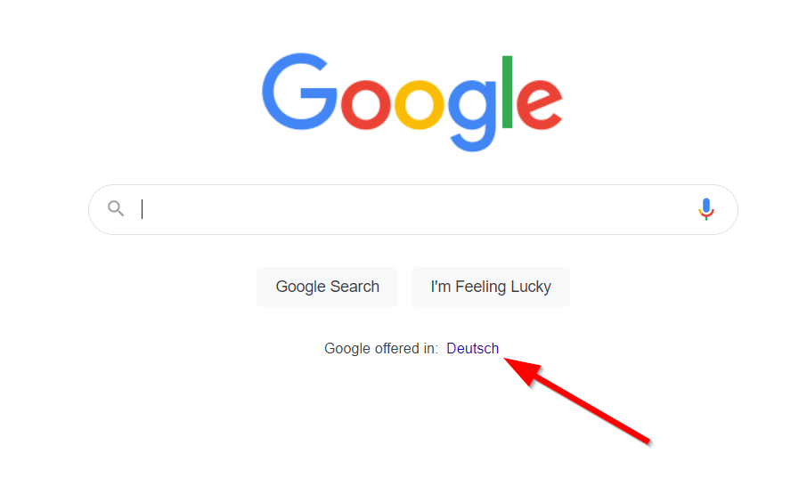
For example, Google adds one or more text links for users to see search results in languages relevant to their location.
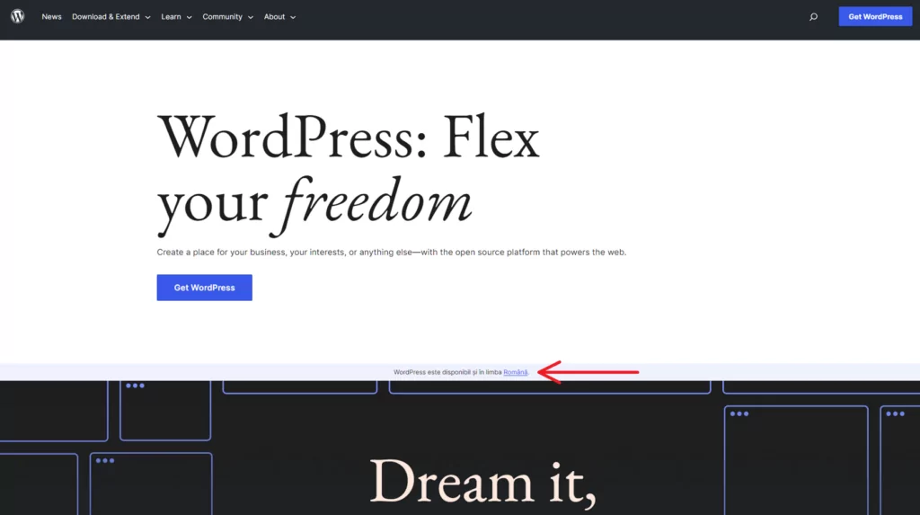
Similarly, WordPress.org allows site visitors to interact with the service in other languages.
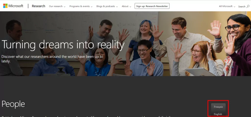
Both examples above use text links. But other sites like Microsoft Research add a typical language button to the bottom of the page.
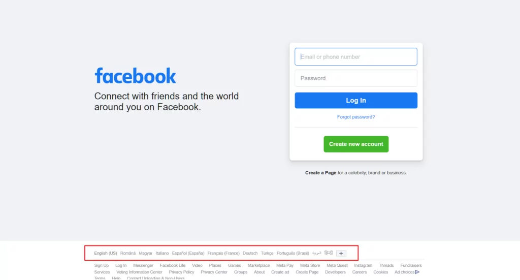
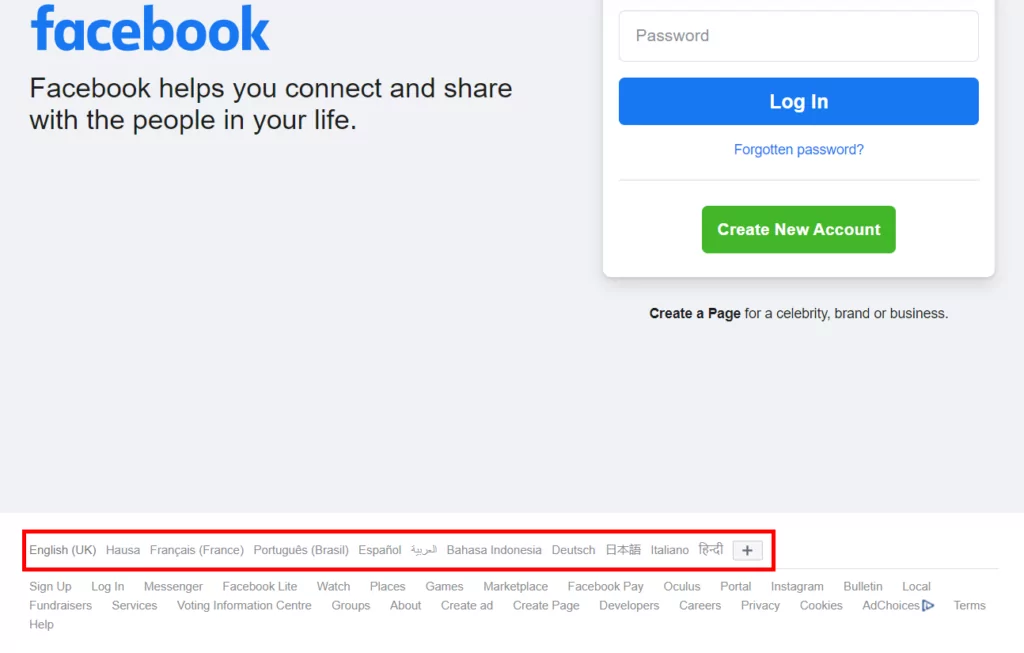
On the other hand, Facebook includes the language switcher as part of the footer navigation.
There’s lots of room for flexibility when choosing a language switcher for your site. Let’s look at some of the most popular options available.
Different Types of Language Selectors to Consider
Looking for the best language switch button for your website? There’s hardly any one-size-fits-all solution.
Granted, language buttons are particularly popular these days. But there are also other options you may want to try out. Your final choice will mostly depend on the nature of your site and your design preference.
Here are some common solutions businesses use for language selection on their websites.
Language Buttons
A language button is one of the commonest solutions for language selection on websites. You can add one to your site’s main navigation menu or any other strategic location. After clicking this button, the user will see a simple dropdown of the available languages.
It’s a very simple strategy to help your site visitors toggle between different localized versions of your site. Probably the biggest design consideration here is the number of languages that can fit in the dropdown.
With language buttons, the fewer the languages on display, the better. Anything over 4 to 5 languages often looks too busy. Also, it’s important to place it in a location where the user can easily find it. We’ll talk more about these factors later in this article.
A language button may be ideal for businesses targeting specific markets or an international community in a specific location. For example, it makes sense for an eCommerce store in Texas to include Spanish and English translations on their site.
Dedicated Selection Menus
For most websites, adding a simple language switch button to a corner of a page may be effective. This is especially true for sites that don’t have a lot of translations.
But everything gets more interesting when you start to deal with more languages. In this case, you may want to design a dedicated menu for language selection. It can be in form of a unique dropdown menu or even a different page with a list of languages.
Some sites like Microsoft combine language selection and region selection in the same menu. This way, site visitors get to see only the products and services available in their region. The content will also be in their native language.
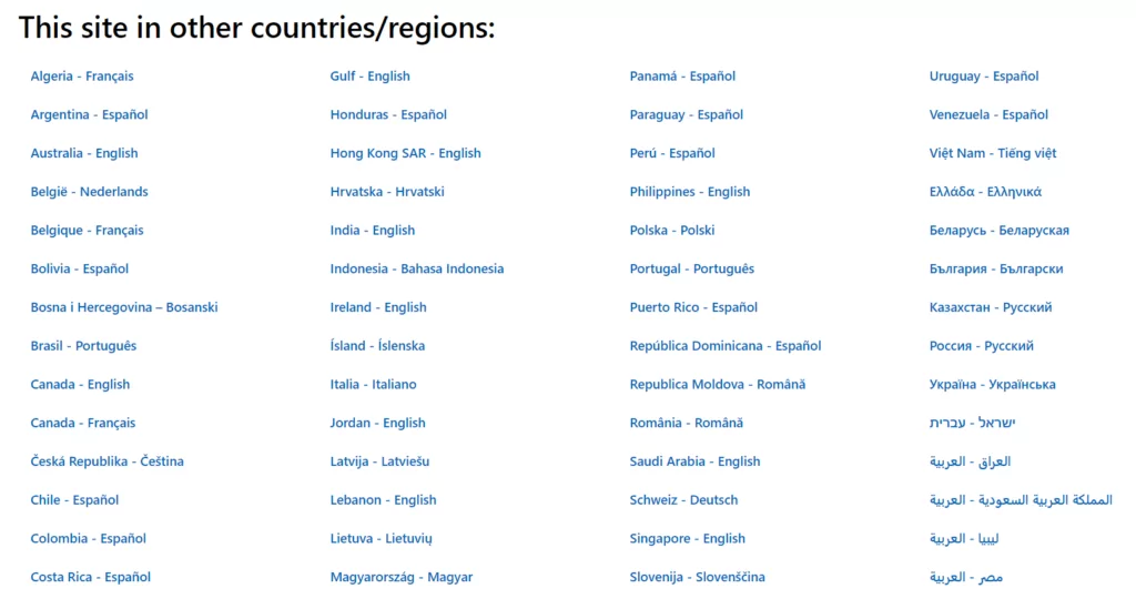
In this use case, a text link is added at the left corner of the footer. Once the user clicks it, the site will redirect them to the dedicated menu page.
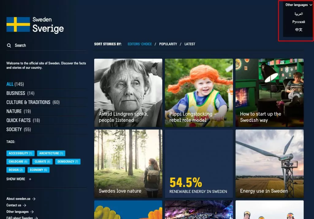
Another option might be to add a dropdown menu to a particular location of the site. This menu may include regions, countries, language names, and language flag icons. It can be added as an introductory menu when a user visits the site.
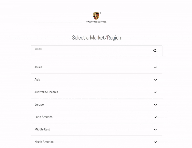
This selection menu also includes a search feature for even faster navigation. As earlier mentioned, this approach is ideal for large sites with lots of language options.
Text Links
The third option is to go the simple way of hyperlinking different versions of your site in plain text. Google uses this approach in their search engine.
All the user needs to do is click the name of the language to see the translated version of the site. Text links generally fit in the footer better. You can house multiple text links with the language names here.
If your site has lots of translations, you can simply add one text link. When clicked, this link redirects site visitors to a dedicated page with more text links to all the available languages.
For every choice of a language selector, there are certain considerations to bear in mind. To get the best of your site’s language button, you need to pay attention to its design, placement, and other important factors.
The simple tips we’ll be sharing below will help you avoid some of the most common errors that limit the effectiveness of language buttons.
6 Top Tips for Optimizing Your Language Button
The big idea behind language button design is to ensure a seamless experience for your users. You want your customers to be able to switch between different site translations as easily as possible. Implementing this UI/UX feature properly will boost your customer satisfaction significantly.
Here are 6 simple tips to help you achieve that.
1. Place the Language Button Where It’s Easy to Find
Arguably the first major factor that determines how effective your language button is is its location. If your customers can’t find it, then they’ll be stuck with the default version of your site. This can lead to a potential loss of revenue. Your localization efforts will also largely be a waste.
Most web users are generally used to having language buttons either in the top or bottom right corner of the page. Putting your language switcher in any of these locations can offer your users a more intuitive and seamless experience.
But there’s no hard rule here. The ideal placement also depends on other features included on your site. Whatever option you choose, ensure that you prioritize discoverability. From experience, you can easily achieve this within the header or footer.
From a scientific perspective, your best bet may be the bottom right corner. Placing the button here means it lies within the terminal area of the user’s vision. In other words, their eyes are most likely to rest here. This will typically lead to more engagement with the language button.
2. Style the Language Button to Complement Your Site Design
Though the language button is largely a UX feature, it’s important to design it from a UI perspective too. The priority here is to ensure that it matches your site design. This means you have to pay attention to the colors, fonts, and overall design language.
There are different translation plugins out there that help you add language buttons to your site easily. You may be tempted to use the default button design provided. But by customizing the default design to suit your website, you can expect to see even more engagement from your site visitors.
Customizing the button’s design may require you to edit your theme’s CSS file or simply configure the plugin’s settings.
Fortunately, TranslatePress automatically uses your site’s design features to generate a complementary language switch button. This way, you don’t have to bother tweaking the plugin’s settings or writing a single line of custom CSS code.
Additionally, you may want to incorporate a language switch icon within your button. Using a globally recognized icon like the ‘globe’ icon or ‘speech bubbles’ can further boost the button’s discoverability.
3. Display Language Names and Initials in the Original Language
After clicking the language button, you can decide to either display the full language name or initials. Choosing either option shouldn’t impact the user experience significantly. But to be on the safe side, you may want to add both the full language name and the initials.
However, more importantly, make sure that you list the languages in their native format. For example, you want to list language names as “English, Français, Italiano, Deutsch, Русский, and Español”. This is more effective than listing them in a default language like English.

A Spanish or Russian speaker may not immediately recognize the words, “Spanish” and “Russian”. Doing this can also help them trust the translated version better.
4. Use Language Flag Icons With Language Names or Initials Always
The other popular debate is whether or not to use language flag icons to indicate languages.
No doubt, flag icons add a lot of aesthetic value to the language selection. But the main argument against flag icons is that a certain country may have multiple official languages. For example, should a Swiss flag represent the French or German translation of a site?
Also, one language may have different variations in different countries. A good example is English in the United Kingdom, United States, and Australia. Which of these flags should be added to an international site?
The truth is flags were never created to represent languages. This is why languages should never be depicted with language flag icons only. You should combine them with language names and or initials.
The TranslatePress multilingual plugin solves this problem easily by allowing you to display both flags and names at the same time.
5. Limit the Number of Languages Added
When setting your language button, make sure you only add the most necessary languages. Most translation plugins offer you the luxury of adding several languages to your site. But it’s important to only add the options that are relevant to your target audiences.
Space is always a major consideration when designing a language selector. So, the fewer languages, the easier it is to plan the navigation layout. Similarly, your site visitors won’t have to scan through so many languages that are irrelevant to them.
6. Implement Automatic Language Detection
Finally, even after optimizing your language button, it’s equally important to enable automatic language detection too.
Wondering why this is still necessary? Automatic language redirection will save your customers the stress of even having to switch languages. This is a great opportunity to offer a truly seamless localized experience.
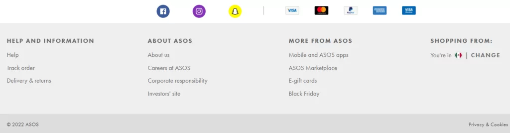
ASOS is one brand that has leveraged this automated approach to ramp up sales in the past few years. The retail store automatically detects your location and serves you the corresponding localized content. But you can scroll to the footer to change your preferences.
Eager to achieve the same results on your site too? You can do this with the TranslatePress Automatic User Language Detection add-on.
Maximizing Your Site’s Language Button
One of the most common and effective ways to help your site visitors switch between different translations of your site is to add a language button. Apart from serving your customers localized content, a well-optimized language switcher also boosts your site’s user experience and conversion rates.
In this article, we shared 6 powerful and highly effective tips to get the best out of your language selector. These tips cover hot topics like button design, placement, and inclusion of language flag icons.
We’ve also used these language button best practices to drive a lot of engagement and sales in the past. We hope they’ll help you achieve similar or even better results too. If you’re looking for an ideal plugin to help you implement these tips easily, then TranslatePress is the way to go.
TranslatePress Multilingual
We hope this article has helped you learn how to optimize your site’s language button. Also, kindly let us know if you have any questions in the comments section below.
If you found this post helpful, please check out our YouTube channel, where we constantly upload short & easy-to-follow video tutorials. You can also follow us on Facebook and Twitter to be the first to know each time we post.