
In this post
In this post
If you’re creating a multi-language website, there are some multilingual website design best practices that you’ll want to follow to ensure you’re creating a great experience for visitors in all languages.
So what are those important best practices? Well, that’s pretty much all this post is about!
Below, we’re going to detail eight multilingual website design best practices to consider when setting up a multi-language website.
These tips will work no matter how you’re making your website multilingual. However, if you’re using WordPress, using the TranslatePress multilingual plugin gives you a step up when it comes to design because you can manage all of your translations from a visual interface. More on that in the post!
Without further introduction, let’s dig into our multi-language website design tips…
Eight Multilingual Website Design Tips and Best Practices
If you want to nail your multilingual website development and ensure an optimal design, follow these eight tips and best practices.
1. Put Your Language Switcher In a Prominent Location
If you’re offering multiple languages on your site, you need to add a language switcher so that visitors can choose their preferred languages.
Because this language switcher will play such an important role in users’ experiences on your site, it’s essential that you place it in an easy-to-find location.
The last thing you’d want is for all the hard work you put into translating your content to be wasted by someone leaving your site because they don’t even realize it’s multilingual.
There are two “main” spots to put your language switcher:
- A floating language switcher, typically in the bottom-right corner. This language switcher will always be visible, even as a user scrolls down the page. This is a great approach if you want to make your language switcher impossible to miss.
- A menu language switcher that’s part of your main navigation menu, typically in your site’s header section. This also makes it very easy for visitors to find, as most visitors will look at your primary navigation menu at some point.
Here’s an example of the default floating language switcher from TranslatePress:

Some websites will also place the language switcher in the footer or sidebar area. However, these areas can be easier to miss (especially the footer), which is why it’s usually better to go with one of the first two options.
If you use TranslatePress to translate your WordPress site, TranslatePress will automatically add a floating language switcher in the bottom-right corner of your site by default.
However, you can easily switch it to a different location, such as adding it as a menu item using the built-in WordPress menu management tool.
To learn more, check out our tutorial on how to add a WordPress language switcher.
2. Don’t Just Use Flags In Your Language Switcher
If you followed the previous tip, visitors should have no problem finding your language switcher. Now, let’s talk about optimizing the design and experience of the language switcher itself.
To make it easy for visitors to choose their preferred languages in your language switcher, you should make sure to include the actual language name in the language switcher.
While it’s fine to include flags in the language switcher if you want to add a visual element to the language selection, you should never use just flags.
As the website “Flags are not languages” reminds us, flags are symbols for countries, not for languages.
For example, let’s say you want to add a flag for the English language. Which flag should you use? Should you use the English flag because that’s where the language comes from? The British flag because that’s more recognizable than the English flag? The USA flag because the USA has more English speakers than the UK?
What about the flag for Hindi? Should you use the Indian flag because there are more than 400 million Hindi speakers there? That kind of makes sense…but then what do you do if you want to also offer Bengali for the 80 million Bengali speakers in India? You can’t use the Indian flag again.
To eliminate any confusion, it’s much better to just include the language name in plain text, typically as it’s written in that language. For example, you would use “Deutsch” and not “German” as “Deutsch” is the more relevant term for a German speaker.
If you really want the visual representation of a flag, you can then add the flag alongside the text.
Flags can also help represent localization. For example, if you have different versions of your site for Spanish speakers from Spain and Spanish speakers from Mexico, adding the flag can help people choose their local version.
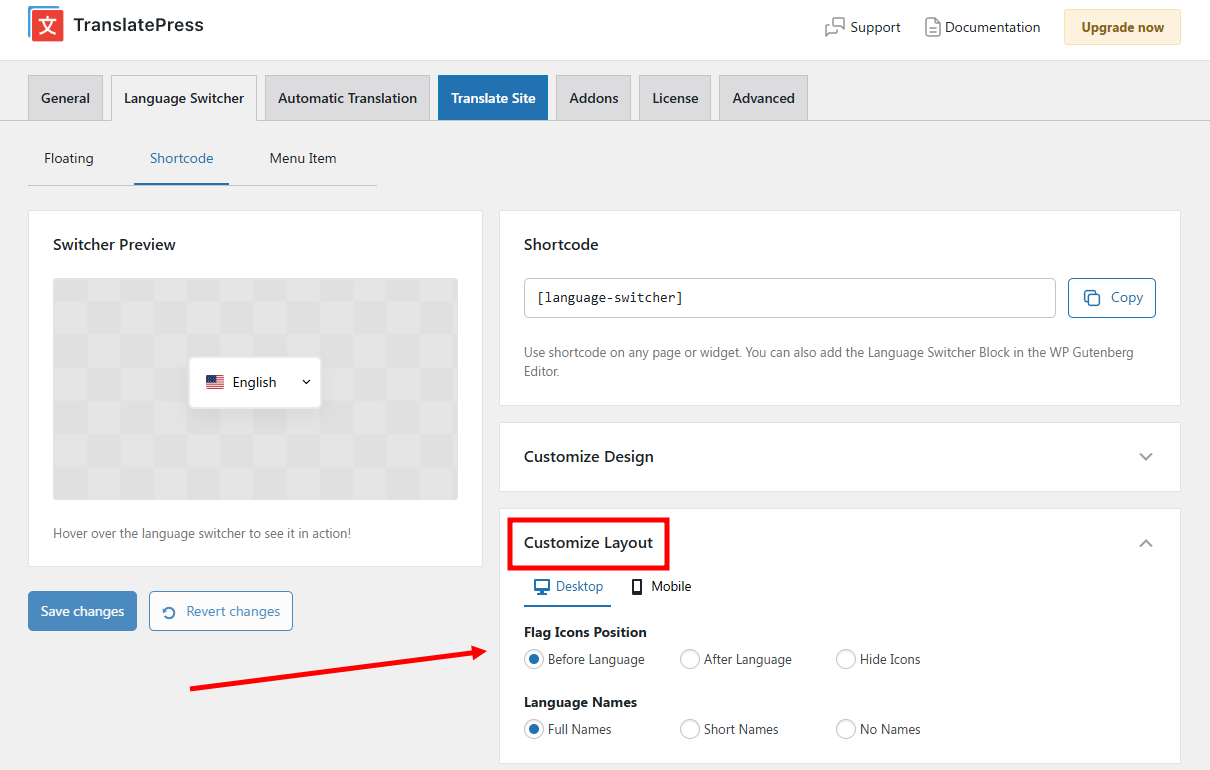
If you use TranslatePress, it’s easy to include both the text name and flag in your language switcher. Or, you can also easily disable country flags if you don’t want to use them.
You can access these settings by going to Settings → TranslatePress → Language Switcher tab. You’ll find the flag options in the Layout section of each switcher type.
For more tips, we have a full guide on optimizing your language switcher button.
3. Use a Multi-Language Website Template for Consistent Design
To ensure a consistent experience across different languages on your site, you’ll want to make sure you’re using the same basic multi-language website template for each language.
That is, you don’t want your site to look completely different depending on the language a person has chosen.
It is good to localize your site. For example, you might switch images, icons, secondary colors, and so on based on a user’s language (more on these later).
But in terms of the fundamental design of your website, you don’t want it to change, as this can be confusing to visitors when they see something completely different after changing languages.
If you’re using WordPress, this is easy to achieve. For example, when you use TranslatePress to translate your WordPress site, your site will still use the same WordPress theme no matter which language you choose.
But at the same time, you do have the option to go in and tweak smaller design details for localization, such as changing images.
4. Check Your Design In Different Languages to Catch Issues
When you created your website design, you probably made sure that everything looks just right using text in your original language.
For example, maybe you went through a few rounds of editing just to make sure that the headline on your homepage only takes up a single line on desktop devices.
Unfortunately, when you translate your website into a new language, all of that careful work you put into optimizing the spacing in your design might change.
The translated text could be longer or shorter than the original text, both of which can have awkward effects on your site’s spacing and design.
To account for this, you’ll want to check your design in different languages and adjust things if needed.
For the easiest way to accomplish this, you can use a translation tool that gives you a visual preview.
For example, if you use TranslatePress to translate your site, you’ll be able to manage all of your translations from a visual interface that gives you a live preview of exactly how your site will look to visitors in different languages:
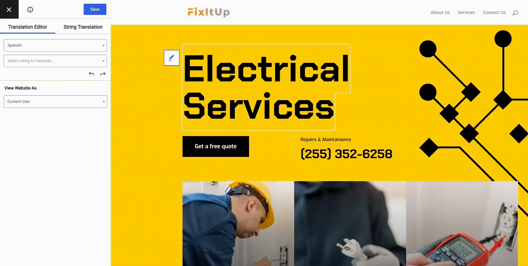
This lets you easily make adjustments as needed to create the perfect design no matter which language a person is browsing in.
5. Check for Font Compatibility and Encoding Issues
Another design detail that you’ll want to double-check is any issues with your font compatibility or encoding.
If all your languages use the Latin alphabet, you’re unlikely to run into any issues. However, once you get beyond that, it’s important to make sure that your font is compatible with all of the languages on your site.
For example, not all fonts support the Cyrillic alphabet, which can be a problem if you’re translating your content into any Slavic languages (such as Russian).
You can find a number of useful tools that let you check a font file’s compatibility. Here are some good options:
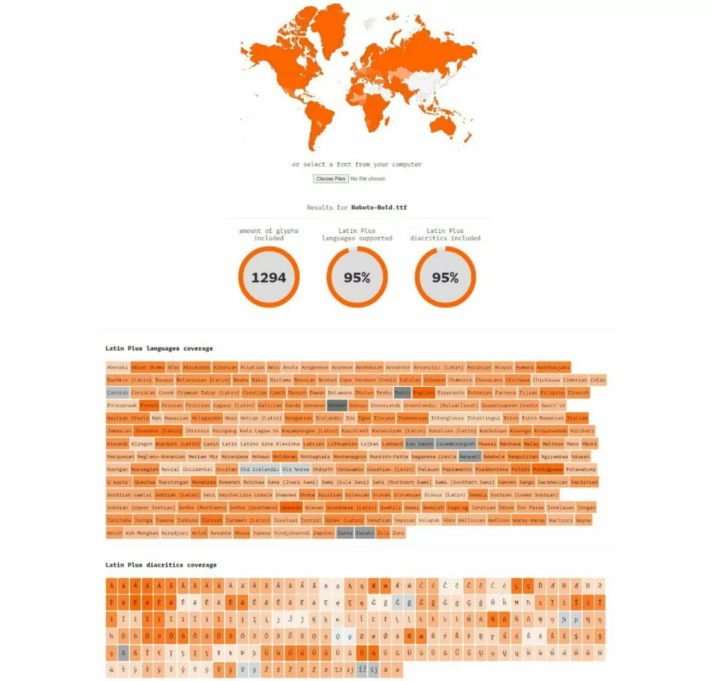
- Underware.nl – uses a map to show you your font’s compatibility. This isn’t perfect because, as we discussed above, countries are not languages. But it still gives you a pretty good idea of a font’s coverage at a single glance. Below that, you can get a much more detailed look at its coverage.
- Alphabet CharSet Checker – a more complex and configurable option that lets you check specific languages.
For example, here are the results for the popular Roboto font (in bold) from the Underware.nl tool:
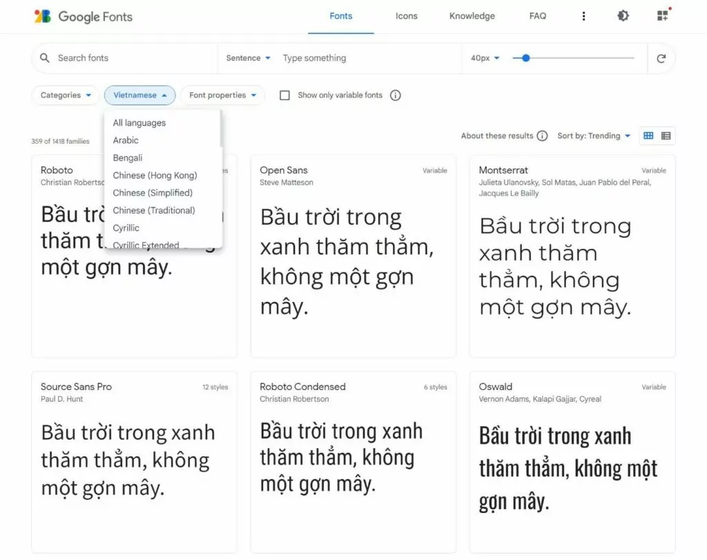
Some font marketplaces will also give you tools to preview/download fonts in different languages. For example, Google Fonts lets you choose a language to see fonts that support that language (and view preview text in that language):
Finally, you should also use UTF-8 encoding, which will help make sure that a language’s special characters are displayed no matter what.
If you’re using WordPress, it should automatically use UTF-8 encoding without requiring any input from you. However, for custom-built websites, you might need to manually specify UTF-8.
6. Adjust Images and Icons for Localization
Website localization is an important multilingual website design best practice to ensure an optimized experience for visitors from different locations.
Whereas translation is about translating your content into the new language, localization is about updating other design details to match.
For example, let’s say you have a page where you want to show a famous landmark in each country. For the English/USA version of the page, you might have the Statue of Liberty.
However, if you translated that page into French, it wouldn’t really make sense to keep that same image. Instead, you might change it to the Eiffel Tower. This would create a more “local” experience for French visitors.
Beyond images, you might want to localize other visual elements, such as the icons that your site uses.
Basically, think about all of the visual elements on your site and whether it might create a better experience if you changed those elements based on a user’s language.
If you’re using TranslatePress, here’s how you can translate images and other visual elements.
7. Adjust Formats If Needed (Date, Time, Etc.)
For another important part of website design localization, you’ll also want to adjust the format of various content on your site, such as dates, times, and so on.
The most common example would be different date formats – e.g. month/day/year vs /day/month/year.
Some languages might also use different time formats – e.g. a 12-hour clock vs a 24-hour clock.
If you’re using any of these formats in your design, you’ll want to update them based on a user’s language.
8. Adjust for Right-to-Left Languages If Needed
This last multilingual website design tip won’t apply to all websites. However, if you want to offer your site in right-to-left languages in addition to left-to-right languages, that will obviously require some design adjustments.
Here are some common design tweaks that you’ll need to make to account for right-to-left languages:
- Aligning text to the right instead of to the left.
- Mirroring some icons when needed (only if the meaning of the icon changes based on its direction).
- Updating images to read right-to-left if needed.
- Changing form fields and alignment.
- Switching the layout of the header (for example, put the logo on the right side instead of the left side as is common with left-to-right languages).
- Aligning breadcrumbs to the right instead of the left.
Basically, you’ll want to think about mirroring many of the elements on your site to change them from left-alignment to right-alignment.
Create the Perfect Multilingual Website Design Today
Creating a multilingual website is a great way to provide a better user experience for multilingual visitors and connect with more visitors in the first place thanks to multilingual SEO.
However, if you want to get the most from your translation efforts, there are some important multilingual website best practices that you’ll want to follow when it comes to design.
Implementing these practices will ensure that your visitors have a great experience on your site, no matter which language they’re browsing.
If you’ve built your site with WordPress, you can use the free TranslatePress plugin to create a multilingual website that follows all of these best practices. Not only does it give you all of the tools you need to fully translate and localize your site, but it also uses a visual interface so that you can easily connect the design of your website to your translations.
If you want to get started, check out our guide on how to make a multilingual WordPress site.
If you have a WooCommerce store, we also have a guide on how to create a multilingual WooCommerce store.
TranslatePress Multilingual
Do you still have any questions about multilingual website design or multilingual website best practices? Let us know in the comments!
If you found this post helpful, please check out our YouTube channel, where we constantly upload short & easy-to-follow video tutorials. You can also follow us on Facebook and Twitter to be the first to know each time we post.
Thank you! It’s informative yet simple description. As a part of Contenteam, the guys who localize websites, i want to add that all the consideration taken for translation and design is always paid back. And yep, the issue with that language indicator – to me it seems logical to place it up in the corner. And make sure it works, as sometimes it’s impossible to unfold.