
In this post
In this post
If you want to rank well, following mobile SEO best practices on your website isn’t optional. Without delivering a great experience for mobile users, your site is unlikely to perform well.
Not sure how to get started? That’s what we are here for.
Read on to learn why mobile SEO matters so much, how well-optimized your site currently is, and how to improve your design, performance, and content for mobile users.
What Is Mobile SEO?
Let’s start off with a definition. Mobile SEO means optimizing your site for ranking well in searches performed on mobile devices. That mostly means smartphones, as Google considers tablets a device category of its own.
Is mobile SEO very different from “traditional” SEO ? While there are many parallels, you need to account for a few key differences:
- User experience – Mobile screens are smaller, and your site has to provide an equally good experience on them as on bigger screens. This means it needs to be readable and usable on phones without panning or zooming, operable by touch, and load fast.
- Mobile keywords – Many mobile searches happen while people are outside. As a consequence, they often have local intent and/or are done using voice commands. For that reason, mobile keywords are often different from their desktop counterparts.
- Appearance in search – Search results also look different on mobile devices. You need to know how to make sure your pages look good in them.
Why Does Mobile Friendliness Matter?
The significance of mobile SEO and why you should pay attention to it is best explained with a few statistics.
Most Internet Traffic is Mobile
For one, more than half of all Internet traffic (62.71% at the time of this writing) comes from mobile devices.
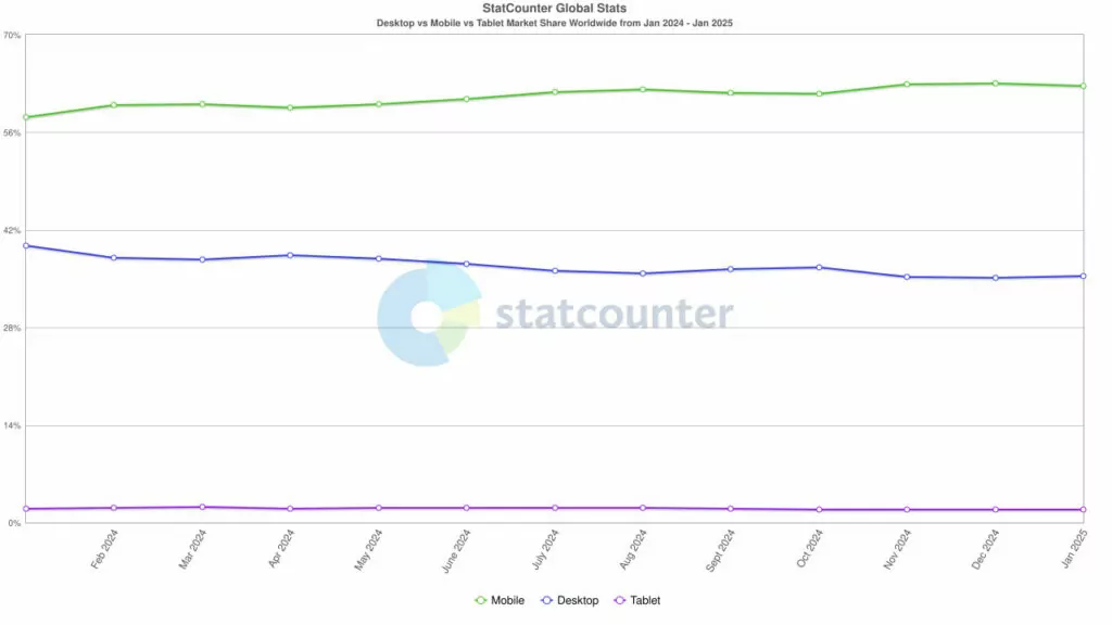
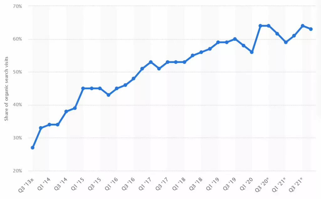
What’s more, in 2021 63% of US search engine visits were from mobile, a figure that’s likely higher in other parts of the world.
What this means is that a large part, if not the majority, of your audience likely searches for content and websites such as yours using their smartphone. If you fail to provide them with a good experience, they will take their traffic elsewhere.
Google Uses a Mobile-First Index
Google, the search engine with close to 90% global market share, completed switching to a mobile-first index in 2023.
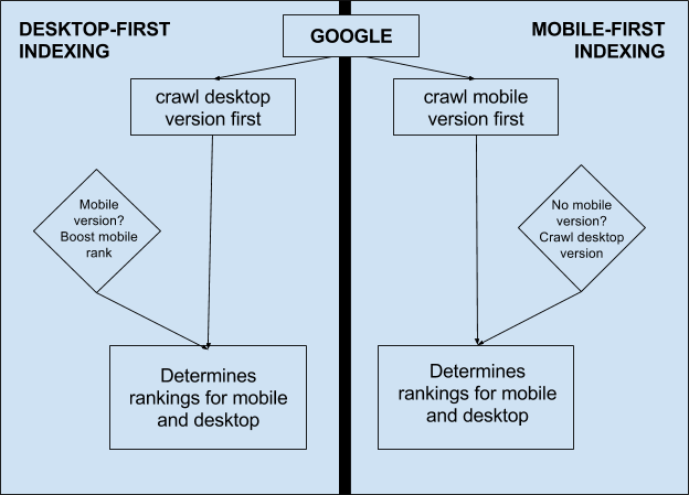
That means it prioritizes your website’s mobile version to determine where your pages should appear in search results. That includes desktop searches. Consequently, the mobile version of your website needs to be an absolute priority.
In short, failing to follow mobile SEO best practices snubs both visitors and search engines. Ignoring that is a risky decision if you rely on search engine traffic for your website and/or business.
How to Optimize Your Website for Mobile SEO
Use the following tips and techniques to help your site rank well in mobile search.
1. Follow General SEO Tips
To do well in search engines, regardless the devices visitors use, you need a proper foundation. For SEO that means:
- Ensure your website is accessible for search engine crawlers.
- Secure your site with SSL/HTTPS encryption.
- Use an SEO-friendly URL and site structure.
- Implement proper internal linking and fix any 404 errors.
- Generate and submit a sitemap to webmaster tools.
- Fine-tune your robots.txt file for optimal crawling.
- Prioritize malware protection and enhance site accessibility.
In addition, don’t block search engines from accessing important resources like CSS and JavaScript. This used to be common practice to make websites load faster, but these days search engines need to be able to render your website the way visitors do. Otherwise, they can’t decide whether it’s mobile-friendly or not.
2. Test Your Site’s Current State
Testing your site is a good idea to estimate the work ahead. It also allows you to establish benchmarks that you can compare yourself to in the future.
Check Google Analytics
As a first step, examine mobile traffic in Google Analytics. You can do this under Reports → Tech → Tech Details. Choose Device category as the dimension, set the date range to at least a year, and enable a comparison with the preceding period.
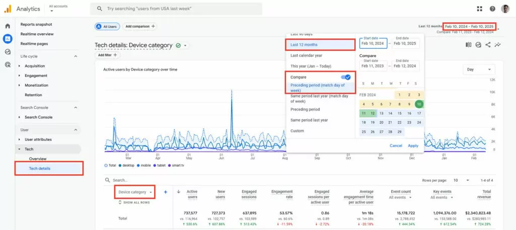
Check if your mobile traffic has gone up or down, especially in comparison to desktop traffic. In addition, examine visitor behavior, such as bounce rate and dwell time.
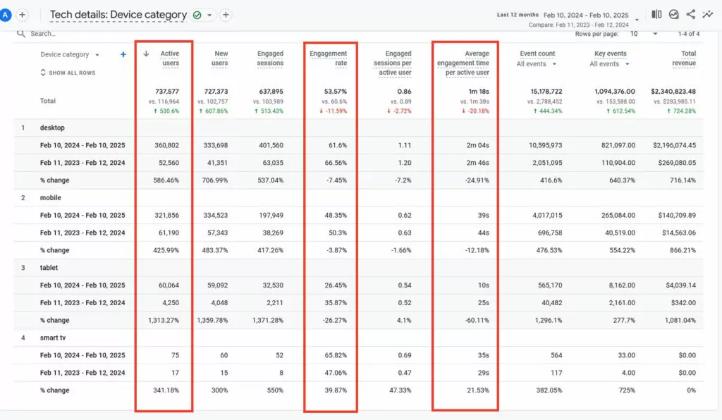
If your mobile numbers are significantly worse, you might have some work to do.
Look at Search Console
Next check Google Search Console for how your site is doing in mobile search. Under Performance → Search Results, click Add Filter → Device, choose Compare, and then pick desktop and mobile.
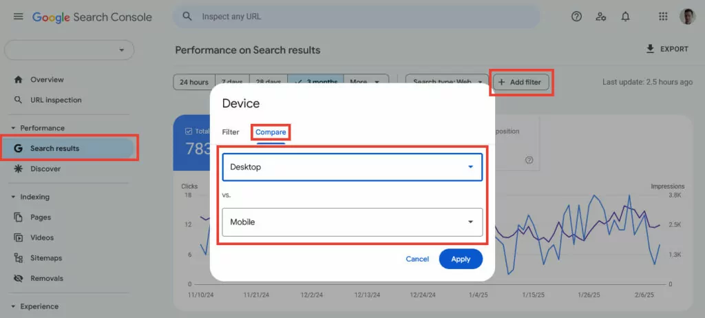
See if there are any significant discrepancies, especially in click-through rate and average position. This might alert you to search appearance issues or similar problems.
Use the Bing Mobile-Friendliness Test
Finally, you can test your mobile-friendliness on Bing.
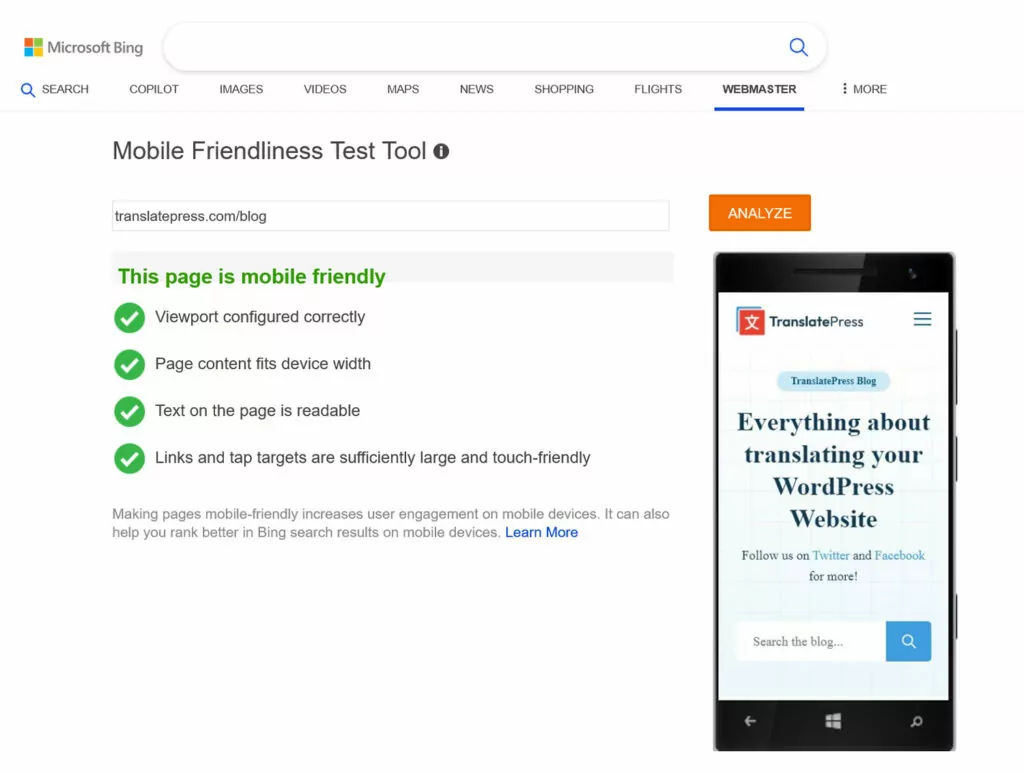
Among other things, it checks your site whether:
- The viewport is properly configured.
- Page content adjusts to fit the device width.
- Text is clear and easy to read.
- Links and tap targets are large enough and touch-friendly.
With benchmarks in hand, you can start implementing mobile SEO best practices on your site.
3. Use Responsive Design
To be mobile-friendly, your site needs to display well on smaller screen sizes. While there are several ways to accomplish this, the easiest one—and the one that Google recommends—is using responsive design.
Here, the layout of your site automatically adjusts to the screen it appears on.

That not only means you don’t have to pan and zoom to view the content but also, for example, that text stays legible.
There are two other options to implement mobile design:
- Dynamic serving, where the server detects the visitor device and sends different website files to mobile and desktop users.
- Setting up completely separate URLs for the mobile and desktop site version.
Responsive design has the benefit that your content stays the same on any device. You also only have one site to maintain, and don’t need to interlink between different versions with canonical tags or redirects.
Check your mobile design by opening the mobile view in your browser’s developer tools (Ctrl/Cmd+Shift+M in most browsers).
Should your site not adapt automatically yet, it’s high time to correct that. You typically implement responsive design with CSS media queries. If you are using a CMS like WordPress, your theme should be responsive by default. If not, it’s time to upgrade or switch it.
But even if your site already adapts to screen sizes, be sure to do some testing as well. Use different devices to access your website. See how easy it is to use with a touchscreen, if buttons are large enough (at least 48px x 48px), and how navigating it feels overall.
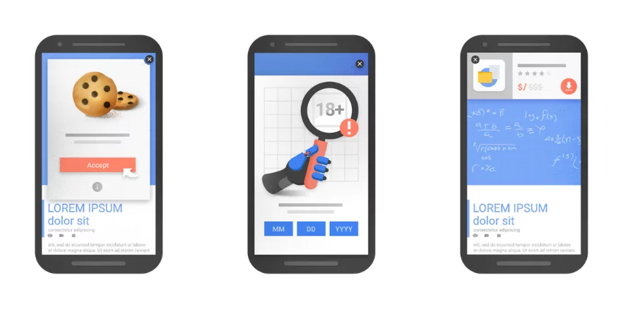
4. Avoid Intrusive Popups
Popups or interstitials are a user experience issue in general, but especially on mobile. The reason: smaller screens are blocked more easily, and popups are harder to close via touch control.
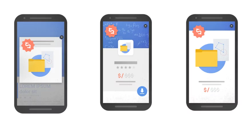
In addition, popups can prevent search engines from accessing content, leading to poor search performance. All reasons why Google rolled out an update in 2016 to target intrusive popups.
Best practices to avoid getting penalized:
- Avoid popups that cover most or all of the page content, especially immediately after page entry.
- Use in-content banners instead.
- Ensure interstitials are easily dismissible, with a clear and visible close button.
- Bind their appearance to user action, such as a click.
- Test interstitials for mobile responsiveness to ensure they don’t negatively impact the user experience.
Exceptions include legally required popups like cookie banners and age verification popups. “Reasonably sized” popups are also allowed.
5. Optimize Website Performance
Page loading time is a major SEO factor—not just for mobile. Just a few seconds waiting time can greatly increase the number of visitors who leave a site without even seeing it.
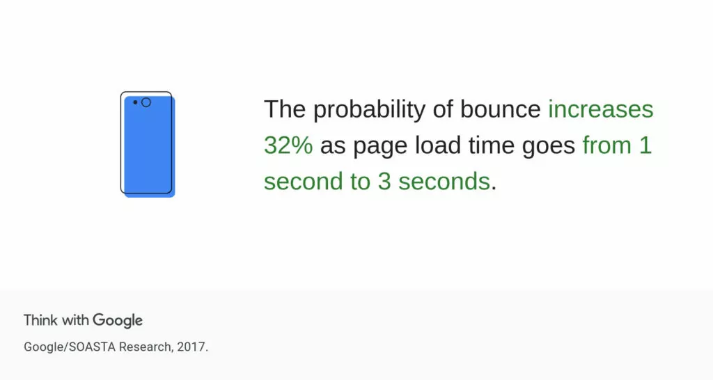
In addition, mobile visitors are often more affected by speed issues because mobile Internet connections tend to be slower than broadband. Therefore, optimizing performance is definitely among SEO best practices for mobile visitors.
Test Your Page Performance
The first step is to test your site. A good option is PageSpeed Insights. When you input a page URL, it gives you detailed feedback on the page’s performance as well as tips on how to fix any issues.
It also tests your mobile and desktop versions individually and gives separate reports and recommendations for each of them.
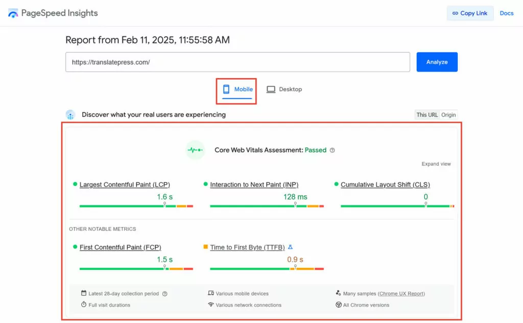
Pay attention to the Core Web Vitals at the top. They are metrics coined by Google that measure how fast your website appears for visitors, how well it responds to user input, and how visually stable it is during load. You’ll get a pass/fail and specific values for each metric.
(Note that the Core Web Vitals panel only appears if Google has enough real-life data, which it collects through people visiting your site using their Chrome browser.)
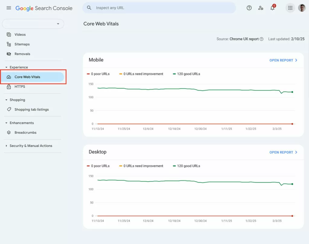
You can also find a report on it in Google Search Console.
Further below in PageSpeed Insights is the Performance diagnosis.
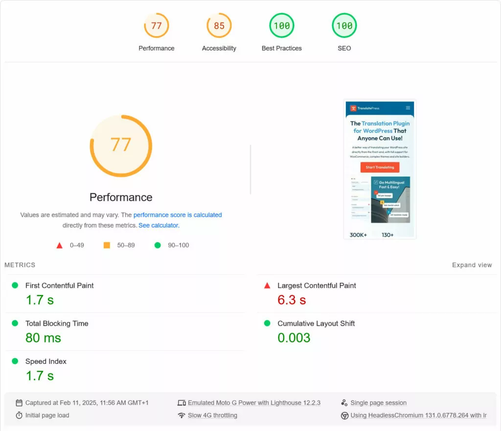
Here, you receive a speed score from 0 to 100 and can see important performance metrics, such as the timing when your first element appears and when the main design has been successfully loaded.
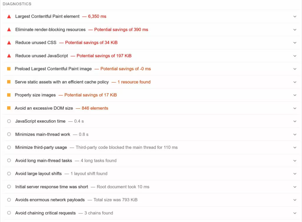
Further below, under Diagnostics, the tool points out specific issues on the page that slow it down, the elements that cause them, and also suggestions for solutions.
Alternative tools for this purpose are WebPageTest.org and DebugBear.
Implement Performance Best Practices
Once you know what slows down your site, the next step is to fix it. What you have to do for that depends on your website and setup. General performance best practices are:
- Use good hosting: Go for a reliable, fast-loading hosting provider with a high uptime guarantee.
- Minimize redirects: Avoid chaining several redirects.
- Enable compression: Compressing means the files that make up your website are smaller and faster to transmit.
- Minify files: This means stripping empty space and formatting from CSS and JavaScript files to shrink them further.
- Concatenate files: Here, you combine several files into one, since downloading one large file is often faster than loading several smaller ones.
- Reduce page requests: The fewer elements your browser has to load, the faster it can do it.
- Activate caching: This technique saves pre-rendered versions of your pages on the server so the browser can download them directly instead of rendering them from scratch.
- Sign up to a CDN: This spreads your files across different servers around the globe so visitors can receive them from the nearest one.
Implementing just a few of these can improve site performance significantly.
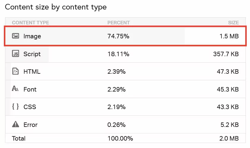
Optimize Images
Images are often a major factor in page speed due to their size. They contain much more data than text, which can slow down the loading process.
Here’s how to ensure your images load as fast as possible:
- Scale to the correct size: For example, don’t upload a 3,000-pixel-wide image if it only takes up 300 pixels on the page.
- Use modern image formats: File formats like WebP and AVIF have a much smaller footprint than older formats like JPG and PNG.
- Compress images: This removes unnecessary data from images without reducing quality. Tools like TinyPNG, Squoosh, ImageOptim, or WordPress plugins like Smush or Imagify can help with this.
- Enable lazy loading: This means images that aren’t visible when the page first appears in the browser won’t be loaded until the user scrolls down to them.
For more tips, check out our article on image SEO.
6. Do Mobile Keyword Research
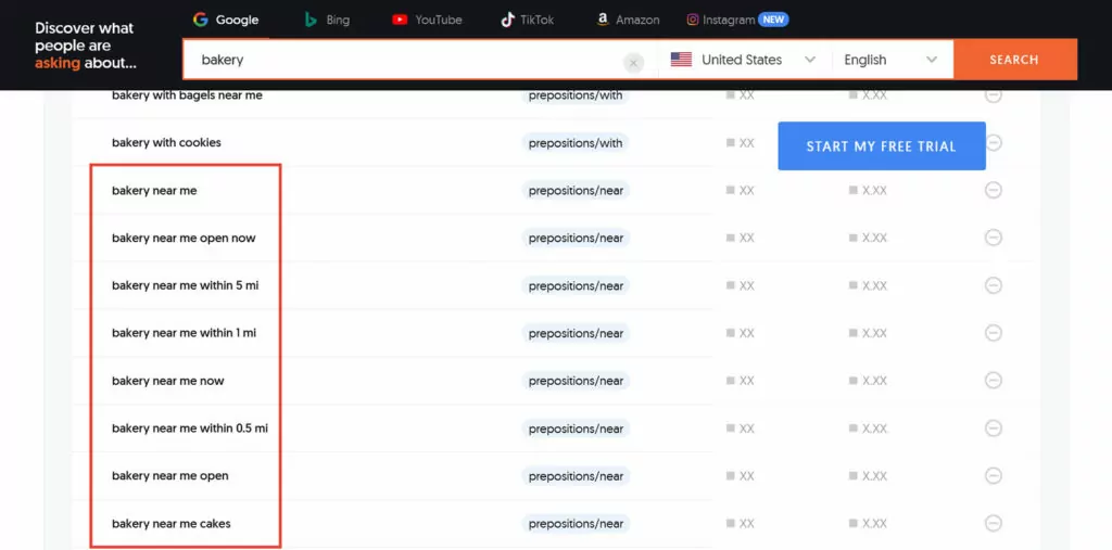
As mentioned earlier, mobile and desktop search behaviors are not the same. Mobile searchers are more likely to look for location-related queries like “bakery near me.” They’re also more likely to use voice assistants like Siri, leading to conversational search queries like “what’s the best bakery near my location?”
If you want to optimize your website for mobile, you need to account for that. Here’s how:
- Focus on question-based long-tail keywords: Use them as section headings or add an FAQ section at the end of your pages.
- Optimize for local search results: More on that in the local SEO section below.
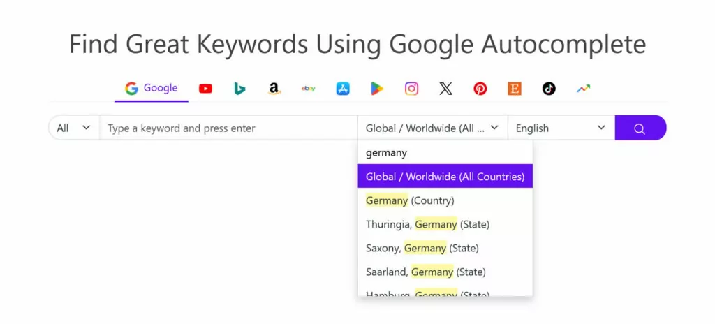
Great tools to uncover conversational keywords include those that mine Google autocomplete, like keywordtool.io, AnswerThePublic, and AlsoAsked.
7. Create Mobile-Friendly Content
Content is one of the most important factors in SEO. To meet mobile SEO best practices, you need to ensure your content is usable on smaller screens. This involves two key elements: readability and search appearance.
Ensure Readability
To ensure your content is easy to consume on smaller screens:
- Use a big enough font size (at least 15px).
- Write short sentences and paragraphs.
- Create additional whitespace with sufficient line height and spacing between paragraphs.
- Divide content sections with headings (in the correct order).
- Keep your introduction short to engage readers quickly.
- Include bullet points, numbered lists, tables, images, and videos for better structure.
- Ensure there is enough contrast between the font and background for easy reading.
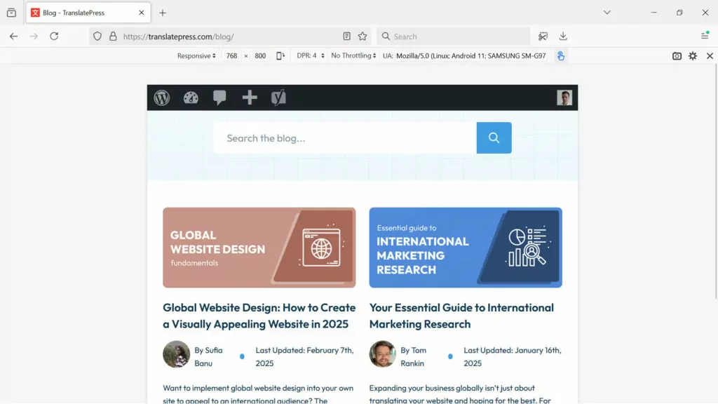
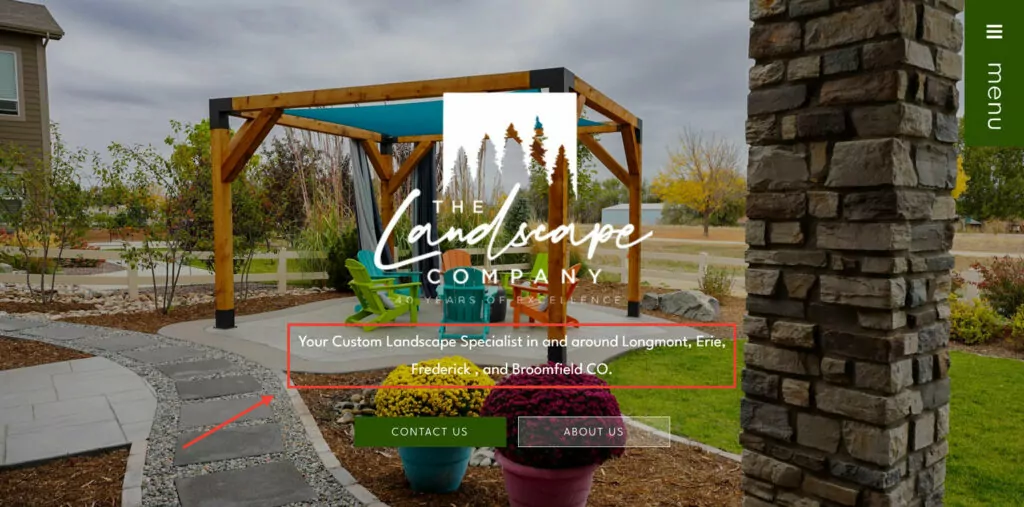
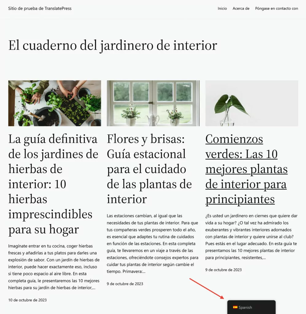
Here is a great example for mobile readability:

Optimize Title and Meta Description
The two most important elements for how your content shows up in search engines are the title and search snippet.
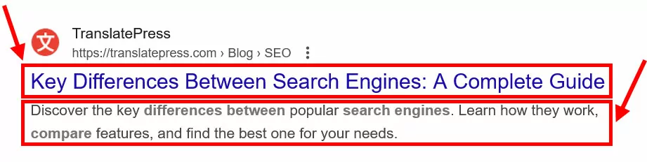
You can influence their appearance by including a title tag and meta description on your pages. While that doesn’t guarantee that Google will use your suggestion (especially for the search snippet), it does help control your search appearance. For example, you can ensure your title doesn’t get cut off because it’s too long.
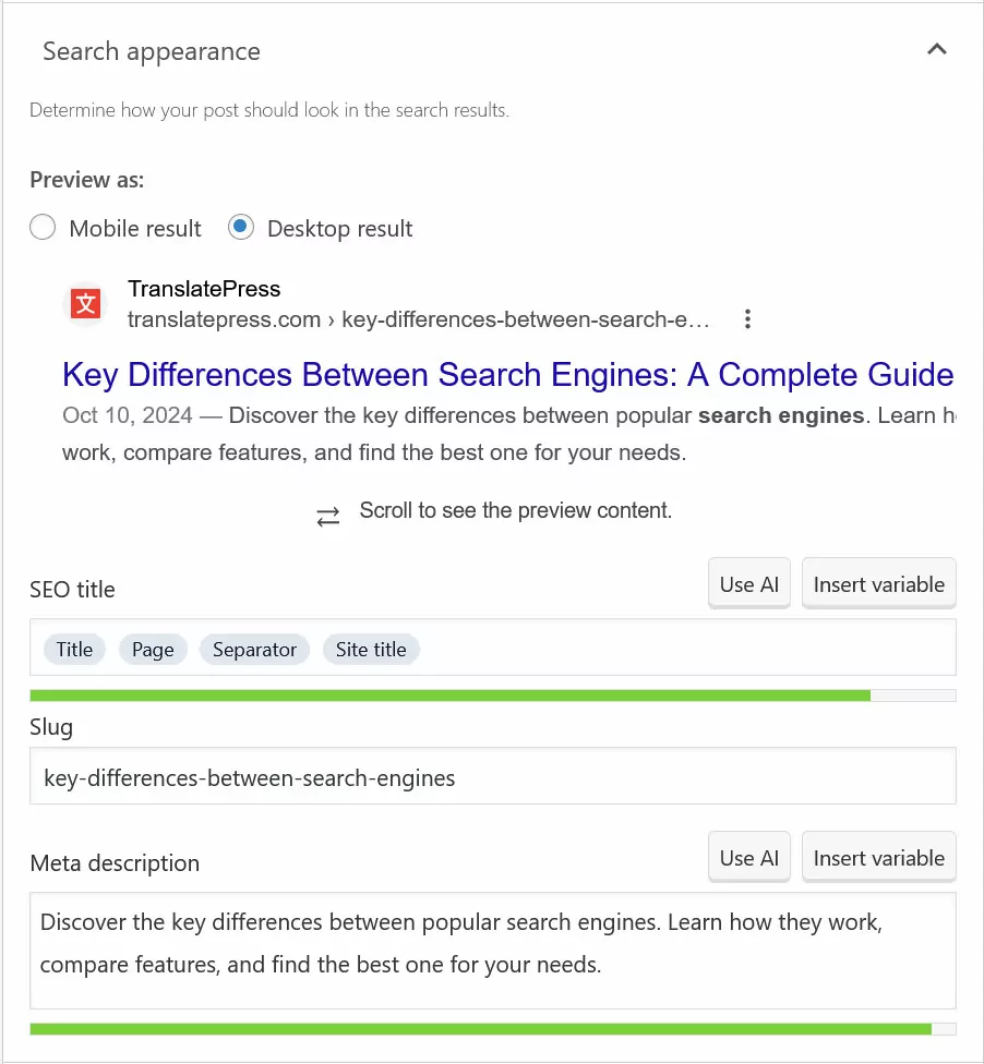
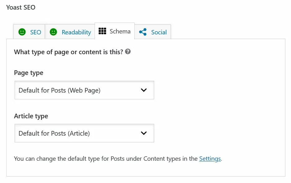
How to this information to your pages depends on how you built your website. For example, WordPress users can customize and preview their title and description with an SEO plugin like Yoast SEO.
If your site doesn’t run on WordPress, you have to do whichever option your platform offers.
Tips for an optimized page title:
- Keep it between 50 and 60 characters.
- Make sure it’s unique to each page.
- Accurately describe the page content.
- Include the main keyword (preferably towards the beginning).
Additional tips for an optimized meta description:
- Keep it under 120 characters.
- Include a call-to-action or value proposition alongside the keyword.
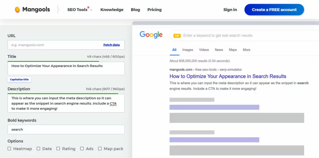
Use the Mangools SERP Simulator to test out titles and descriptions.
Use Structured Data
Structured data is another way to draw attention to your pages in search results. It lets you add supplemental information like ratings, images, or prep times, your page results.

These enhanced results are called rich snippets and you’ve probably seen them before. They help attract more clicks and take up additional space in search results, especially on mobile, giving your pages more visibility.
You can add structured data to your content using Schema markup. It exists for different content and page types, like articles, local businesses, restaurants, book reviews, and more. You can create it using Google’s Structured Data Markup Helper.
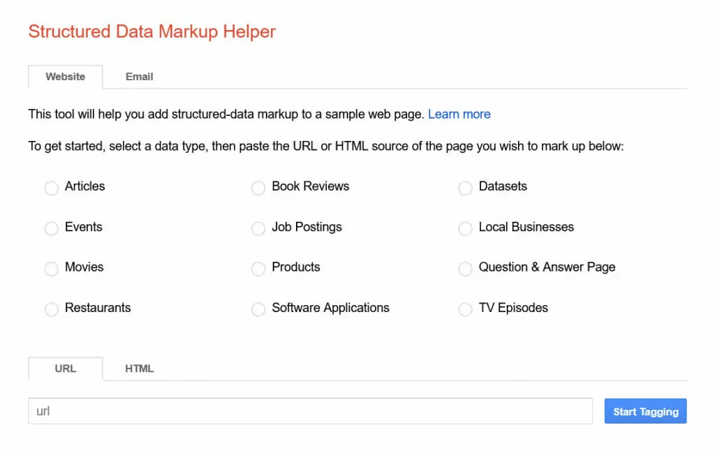
If you’re using WordPress, the easiest way to add Schema markup is by using a plugin such as Schema. Many SEO plugins also have this functionality.
Finally, use Google’s Rich Results Test to verify your structured data afterwards.
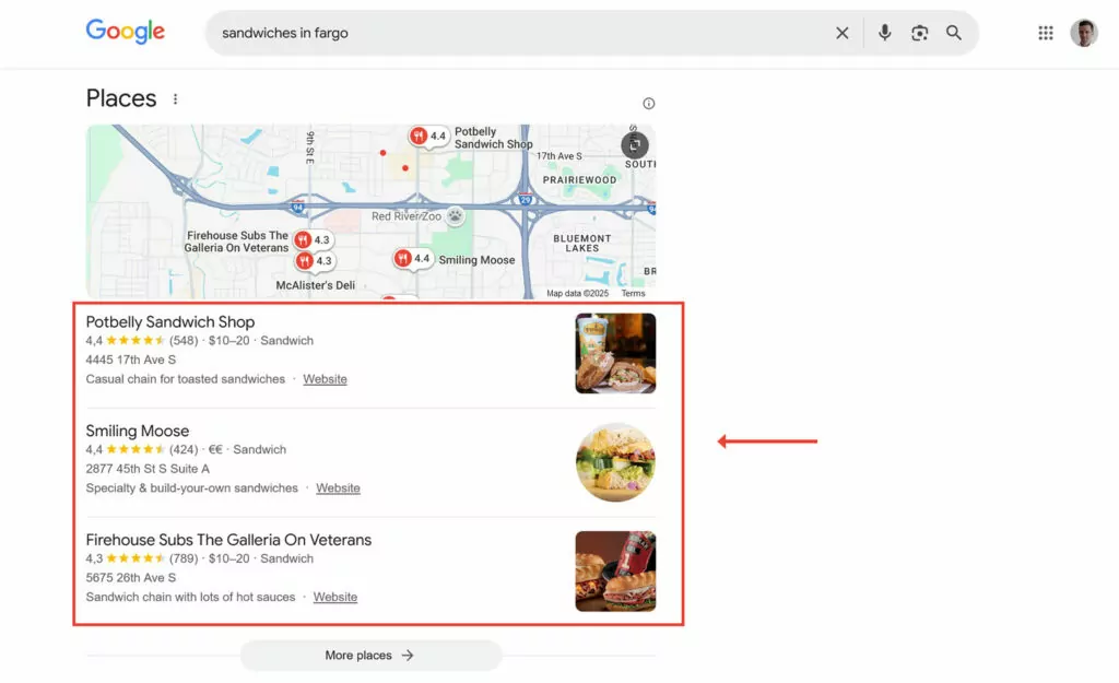
8. Implement Local SEO
As mentioned, mobile searchers are more likely to perform location-related queries. Consequently, if your website or business depends on foot traffic or people finding you in real life, doing local SEO is one of the mobile best practices you need to follow. It will help your business appear in location-based searches like Google Maps results or the local three-pack.
Create and Fill Your Google Business Profile
The most important step here is to create a Google Business Profile.
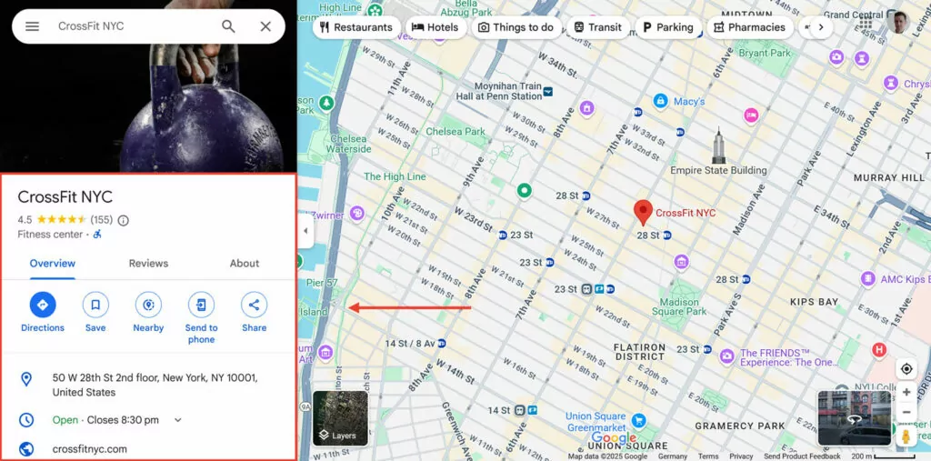
Google uses the information saved in there for its results. To improve your chances of ranking high, make sure to use all it has to offer:
- Provide business details: Include a clear description of your business, contact details, and business hours. In addition, ensure your NAP (name, address, phone number) is consistent with other profiles.
- List services and products: This allows your business to appear in relevant searches for what you are selling.
- Include photos and videos: Use visuals to showcase your store, office, team, and/or products. You can easily create compelling visuals using an AI video generator to highlight key aspects of your business. This makes your profile more engaging and helps potential customers know what to expect.
- Encourage and respond to reviews: Positive reviews boost trust and visibility. Ask customers to review your business and respond to all feedback, including negative reviews, in a professional manner.
Use Location-Based Keywords on Your Website
To improve local rankings, integrate location-specific keywords throughout your website.
You can do this by:
- Mentioning your city, neighborhood, or region in meta titles, descriptions, and content.
- Creating location-based landing pages if you serve multiple areas.
- Referencing local landmarks or events when relevant.
Additionally, list your business in trusted local directories to strengthen your local presence.
Implement Mobile SEO Best Practices for Multilingual Websites
If your website targets audiences in multiple languages and locations, there are additional considerations for international SEO. Let’s go over them and how TranslatePress can help you.
1. Do International Keyword Research
Keywords for the same topic will differ across language markets, and there are often several ways of translating a keyword. Your task is to ensure you’re picking the ones your audience actually uses.
For this purposes, most keyword research tools allow you to search in different languages and locales.
For more details, check out our article on international keyword research.
2. Translate Your Content
An international audience, including those on mobile devices, will use their own language to search for your content. To appear in their search results, you need to translate your web pages.
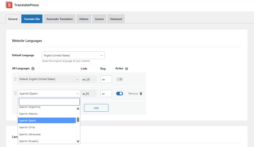
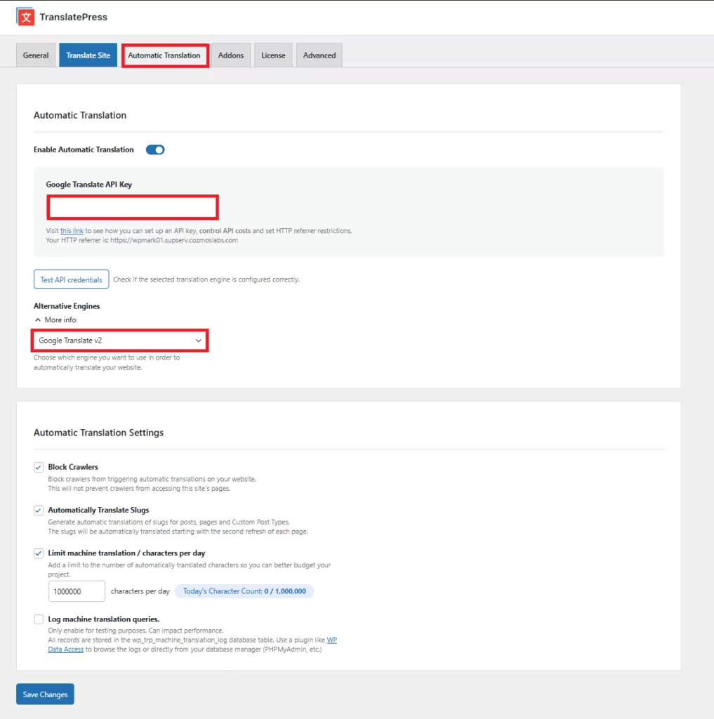
One of the easiest ways to do that is TranslatePress AI. It’s included in every TranslatePress license and you can use it with AI credits available through your account.
All you have to do is to install the plugin, go to Settings → TranslatePress, and define your site’s default language and at least one target language.
Then, click on the Automatic Translation tab, enable it, and click Save at the bottom.
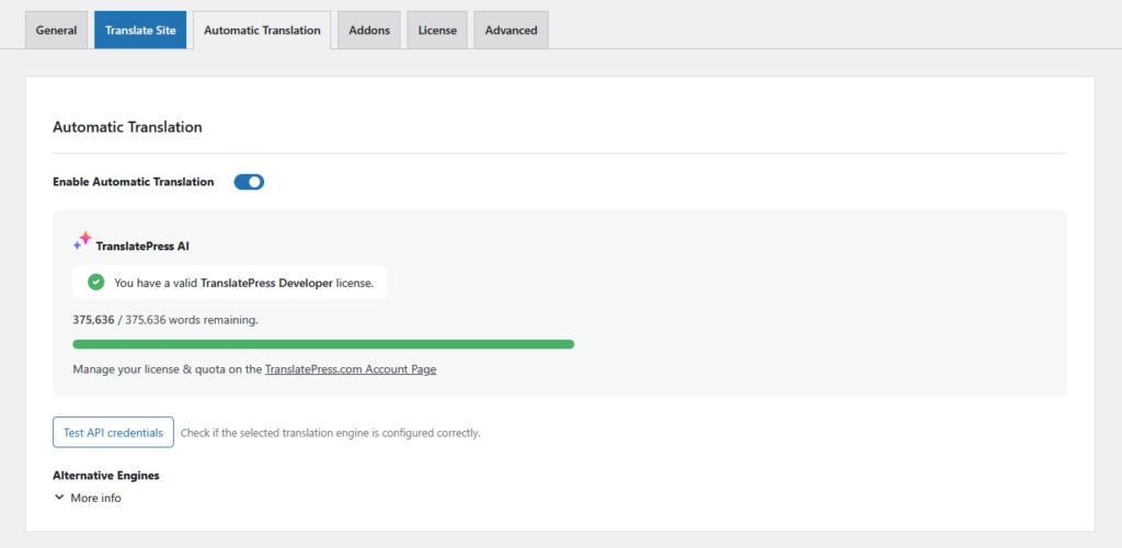
TranslatePress will now automatically start converting your website to your target language(s). You can see this right away when you go to the front end of your site and use the language switcher.
To ensure best translation quality, TranslatePress AI uses several sources for machine translation and automatically picks the most appropriate for your language pair.
Alternatively, you can also use Google Translate or DeepL. They are available under Alternative Engines.
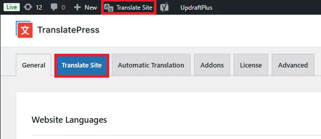
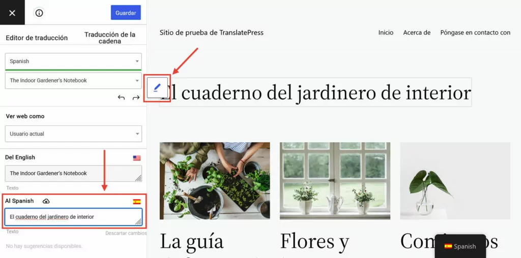
Additionally, you have the option to adjust the automatic translations by hand or even translate your entire website manually. This happens in the translation interface under Translate Site/Page.
Simply pick content from the preview window and enter or edit the translation in the dedicated field.
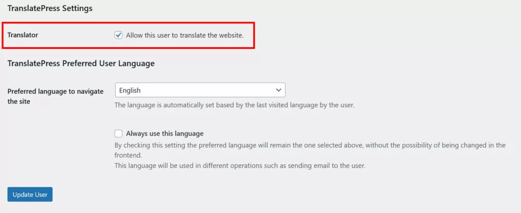
Finally, with a TranslatePress license, you also have the ability to create separate translator accounts. That way, people can work directly on your site when you outsource the translation of your website to freelancers and agencies.
3. Implement hreflang Tags
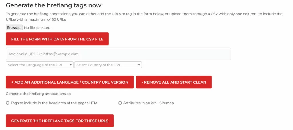
hreflang tags mark your website’s language and locale. This helps search engines understand which language markets your pages should rank for, avoiding confusion and duplicate content if you have the same content in different languages. Implementing them is among the best practices for multilingual SEO, including for mobile.
You can add the tags either in the <head> section of your pages or in an XML sitemap. Use an hreflang generator to create them more easily.
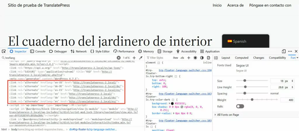
Alternatively, if you use TranslatePress, the plugin automatically adds the correct hreflang tags for every activated language on each of your pages.
4. Translate SEO Titles and Descriptions
As we discussed earlier, one of the mobile SEO best practices is taking control of your search appearance. This extends to the translated version of your site, where you also need to adjust title tags and meta descriptions.
If you don’t want to do this manually, you can use the multilingual SEO pack included in TranslatePress Pro. It automatically converts page URLs, SEO titles, meta descriptions, ALT tags, and other important SEO markers to your target language(s).

When using machine translation like TranslatePress AI, this, too, happens automatically, and you can manually refine it like the rest of your content.
The SEO Pack also creates multilingual sitemaps to submit to search engines and works with most popular WordPress SEO plugins.
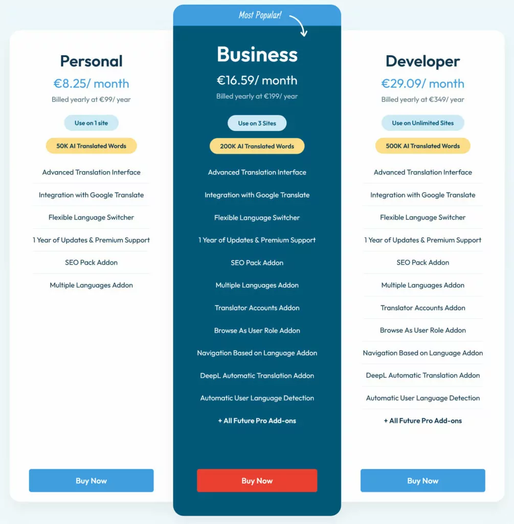
Check out the full feature list to see what else TranslatePress can do for you. The free version is enough to add one extra language to your WordPress site. If you need more than that, pick from the three pricing tiers to find the right option for yourself.
Follow Best Practices to Master Mobile SEO
Doing SEO for mobile is nothing complicated. It simply means acknowledging that people use search and websites differently on their phones than they do on desktop computers and making sure your site can accommodate that. Full stop. The rest is details.
Just don’t forget that mobile users are in the majority, so catering to their needs is mandatory. If you run a multilingual website and want to ace your mobile SEO best practices, TranslatePress is here to help.

