In this post
In this post
When you launch a multilingual website, one of the first design decisions you face is how to present language options to your visitors. Countless sites default to using flag icons. While this can look appealing and save space, they often create more problems than they solve. The issue goes deeper than aesthetics because flags represent countries, not languages.
In this post, I’m going to walk you through the challenges of using flag icons for language selection and show you how TranslatePress solves these problems. I’ll also share the best combinations of flags, language codes, and names that create a clear experience for your international visitors.
Why flag-only language switchers create problems
The fundamental issue with flag-only language switchers is that they mix up geography with language. This confusion manifests in several ways that can frustrate your visitors and harm your site’s usability.
For example, dozens of countries speak English as an official or primary language. If you display only a UK flag, visitors from the United States might wonder if the content caters to British spelling and terminology. If you use a US flag instead, you risk confusing visitors from the UK, Ireland, Canada, and Australia. There’s no single flag that represents the English language without creating this ambiguity.
The problem multiplies with languages spoken across many regions:
- Spanish is the official language in many countries.
- Arabic serves as the official language in yet another batch of countries.
- Portuguese is spoken in Portugal, Brazil, and several African nations.
When you use a single flag to represent these languages, you’re making an arbitrary choice that excludes the majority of speakers.
Some languages face an even more complex challenge because they lack a corresponding nation-state. Kurdish is spoken by millions across Turkey, Iraq, Iran, and Syria, but has no national flag. The same applies to Catalan, which is spoken in parts of Spain, France, and Andorra. For these languages, choosing a flag becomes impossible without creating political or cultural tensions.
There are also regional languages and dialects that don’t have political boundaries. In a nutshell, when your website localization needs include these languages, flag-based selection systems simply cannot accommodate them.
Flag recognition and accessibility concerns with flag-only systems
Most people can identify common flags such as those of the United States, UK, France, and Germany. However, flags from smaller nations or those with similar designs can confuse visitors. For instance, can you distinguish which one of these flags is Romanian and which one is Chadian?

Both use vertical stripes of blue, yellow, and red. The confusion extends to flags that look similar at small sizes, where details become difficult to discern.
Flag-only switchers can often fail accessibility standards too. Much like other images, screen readers cannot interpret flag images without proper alternative text. Even with alt text, the experience remains suboptimal. Users with visual impairments will benefit far more from text labels that clearly state the language name.
When flags might work for your site
I’ve painted a slightly negative overview of using flags, but they can work in certain limited contexts. It’s important to acknowledge these exceptions because they represent situations where the visual appeal of flags outweighs the potential confusion.
The key factor in these exceptions is that flags serve as supplementary visual elements rather than the sole means of communication. When you combine flags with clear text labels, you gain the visual benefit of flags while maintaining usability and accessibility. This hybrid approach lets you have visual appeal without sacrificing clarity.
Sites with few, recognizable languages
If your site supports only two or three languages that have strong national associations, flags might serve as effective visual indicators. A tourism website offering English and French content could use ‘anchor’ flags alongside language names without creating confusion.
The Discover Italy tourism site uses this approach.
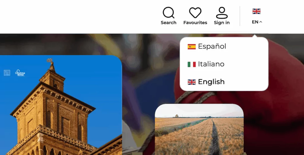
With a limited selection of languages, the flag-plus-name combination works because the language choices are clear and the target audience expects these specific options.
Country-specific content and e-commerce
Sites with strong country-specific content can also use flags effectively. If you run separate versions of your site for the United States, Canada, and the UK, each with localized content, pricing, and shipping information, country flags make sense. In this case, you’re switching the entire country-specific experiences.
For example, Amazon uses flags in aspects of its global navigation because each flag represents a completely different marketplace with unique inventory, pricing, and delivery options.
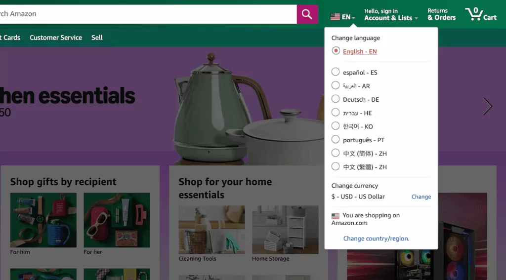
Here, the flags communicate the geographical location rather than just language preference, which aligns with how its platform operates.
The problems with common flag-based implementations
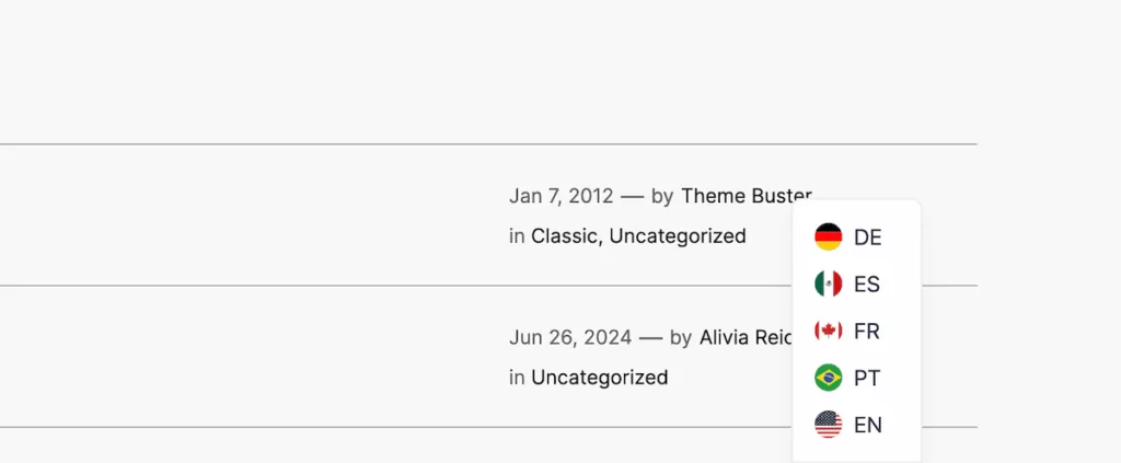
You can often see specific implementation mistakes that build upon the problems of using flag-only selections. For example, many sites use flags in drop-down menus without any accompanying text. The user will see a small flag icon in the header, click it, and encounter a list of more flags.
This approach is problematic because first, users must recognize they can click the flag to access language options. Then they must identify each flag in the menu. It’s worse on mobile because it’s easy to accidentally select the wrong language. Regardless, the result is a poor user experience.
Speaking of mobile, flags need sufficient pixels to be recognizable, but language switchers often occupy limited screen real estate. When you shrink flags to fit in a compact menu, the details that distinguish similar flags disappear.
How to present languages the right way (3 tips)
The best approach to language presentation in my opinion combines multiple elements that work together to create clarity. Here are a few tips to help you get it right at first.
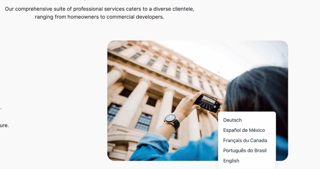
1. Always use native language names
Language names should always appear in their native form. If you offer German, display it as “Deutsch” rather than “German.” Native language names work because people recognize their own language even when surrounded by foreign text.
The BBC website demonstrates this principle across its global services.
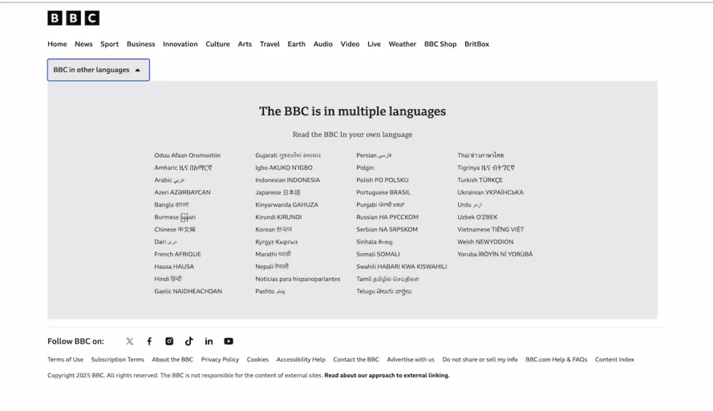
Each language version displays languages in their native scripts and names. This approach ensures visitors can find their language whether they speak Arabic, Bengali, Hindi, or any of the other languages the BBC supports.
2. Consider language codes for space-constrained layouts
Language codes can provide a compact alternative when space is tight. ISO 639-1 codes such as “EN,” “ES,” and “FR” take up minimal space and work well in constrained layouts. However, I recommend using codes only when space absolutely requires it, as they assume users understand these standardized abbreviations.
TranslatePress has a one-click option to use language codes rather than the full name. However, the challenge is that many internet users don’t know the significance of, say, “PT” meaning Portuguese or “NL” representing Dutch. These codes work better for technical audiences or sites where users are familiar with language abbreviations. Financial platforms and developer tools often use codes successfully because their audiences understand them.
3. Account for right-to-left languages
Right-to-left (RTL) languages such as Arabic, Hebrew, and Persian require special consideration because your entire site (and therefore your language switcher) should mirror for RTL languages. Flag-plus-name combinations need to reverse, with the flag appearing on the right side of the text.
TranslatePress handles RTL languages automatically, detects when a language uses right-to-left script, and adjusts the site. This ensures your language switcher maintains a proper reading flow regardless of which language the user selects.
TranslatePress’ language switching options
TranslatePress offers some flexible display options that solve the ‘flag controversy’ while giving you control over your site’s appearance.
TranslatePress Multilingual
The recommended approach is to display flags alongside the full country name. This is the TranslatePress default, and it works well because it’s visually clear. It’s an excellent balance, especially for multilingual e-commerce sites where clear communication is crucial for conversions. However, if your design calls for a more compact approach, you can display flags with language codes instead of full names.
If you want to skip using flags entirely, TranslatePress lets you show only native language names. With this, there’s no potential confusion while maintaining clarity.
While the switcher takes up slightly more horizontal space, it does remove the ambiguity about which language each option represents.
Finally—and yes I’m going to contradict myself a little—you could also choose to display only flags! Sites with a small number of widely recognized languages might prefer this visual approach, although you’ll want to ensure you meet the criteria I offer earlier. After all, it’s a specific option for a dedicated purpose.
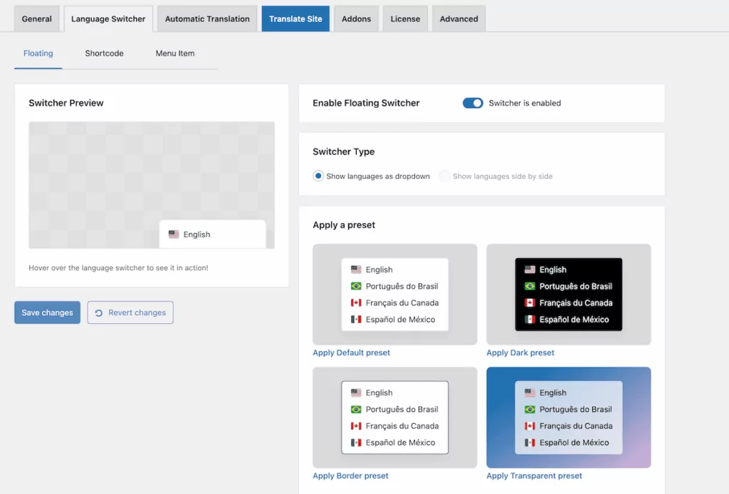
Configuring your language switcher in TranslatePress
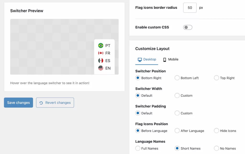
Setting up your preferred language display format in TranslatePress is straightforward and quick to implement. First, navigate to Settings → TranslatePress within WordPress. In the Language Switcher section, you’ll see options for both the floating language switcher and other display methods such as menu items and shortcodes.
You can open up the Customize Layout panel to position the flags or hide them completely. The Customize Design panel also gives you some extra options for displaying flags:
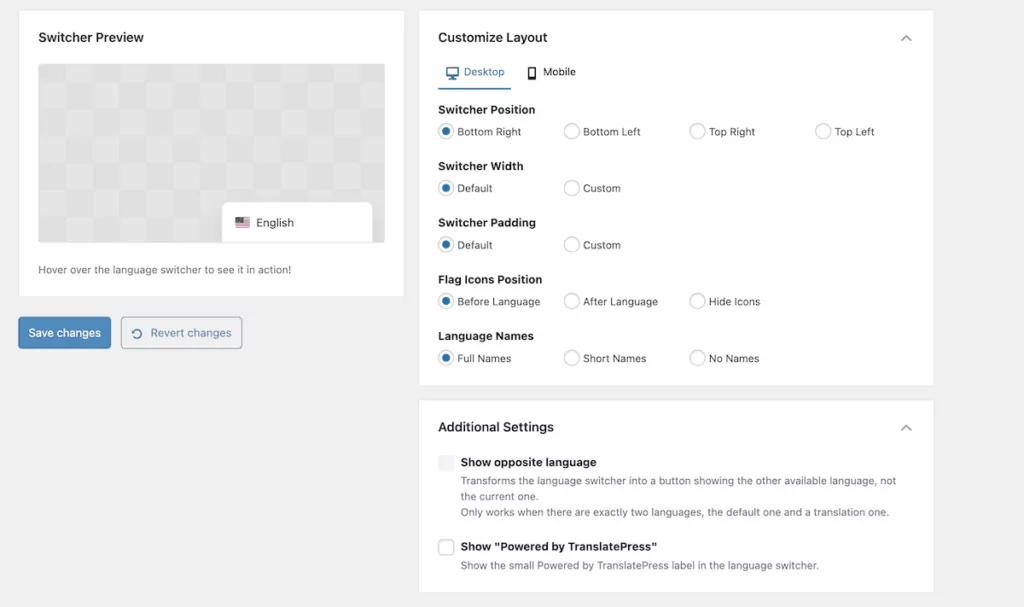
As an aside, you can set your language codes and slugs on the General tab. Once you save your changes, TranslatePress will apply your selections.
Where to place your language switcher
While this post isn’t about language switcher design, I do want to touch on its most optimal location before I wrap up, as this affects how easily visitors can find and use it. There are four distinct places your switcher can live:
- In the header.
- In the footer.
- Floating depending on the page viewport and user scrolling pattern.
- Within your navigation menu.
The header or footer will work well for most websites, particularly when you position your language switcher in the top- or bottom-right corners. The TranslatePress Switcher Preview display gives you a quick indication how this will look but a full-screen site preview will be a better option.
It feels logical to have the language switcher in the header, but I’m personally more inclined to search in the footer if the switcher isn’t floating.
In general, putting the switcher in the footer makes sense where language selection happens once at the beginning of a user’s visit. If most users arrive at your site in their preferred language through search engines or automatic detection, it’s likely that constant access to language options won’t be a priority.
TranslatePress’ default is a floating language switcher, which will be a button that follows users as they scroll. It’s a contemporary way to keep language options accessible without consuming header space or other page real estate.
For sites with multiple menu levels or complex navigation, adding the language switcher to your main navigation menu will be a sound option. TranslatePress’ language switcher options include separate menus for floating, menus, and embedding with shortcodes—so you have plenty of flexibility on hand.
TranslatePress makes language selection simple and clear
TranslatePress’ language switcher options lets you start with sensible defaults that work for most sites, which you can then customize to match your specific requirements. Choosing the right display settings for flags and the associated country-identifying language will do wonders for your UX and, by extension, your site’s reputation.
TranslatePress Multilingual
TranslatePress’ simple (yet powerful) flag options let you present your language switcher in the most optimal fashion for your website. Of course, the plugin also lets you work with automatic translations, manual editing, and SEO functionality to create a well-rounded and complete translation package.
Will you rethink your strategy when it comes to displaying language flag icons? Share your thoughts with me in the comments section below!