
In this post
In this post
Color is a crucial part of your communication strategy, especially for your website. I’ve worked with lots of sites, so have a little insight into how the best colors for your website are not only about aesthetics. Instead, they can dramatically impact user engagement both on a local and global level.
In this guide, I’m going to walk you through how to select the perfect colors for your website, with a special attention on cultural considerations for multilingual sites. Regardless of whether you’re building an e-commerce platform, a portfolio, or an educational website, you’ll learn how to create a color scheme that resonates with your specific audience.
Understanding Color Psychology in Web Design
The first step is to understand how colors influence human behavior and decision-making. Color psychology isn’t just theoretical—it has practical implications for your website’s success.
Different colors can evoke specific emotional responses. For instance, blue often conveys trust and professionalism, which is why you’ll see it frequently used by financial institutions and healthcare providers. For instance, Chase uses blue as part of its logo, which then becomes an accent color across its website:

In (literal) contrast, red can create urgency and excitement. This makes it popular in retail and entertainment sectors. In fact, two huge names that do this are also the most successful: Target and Netflix.

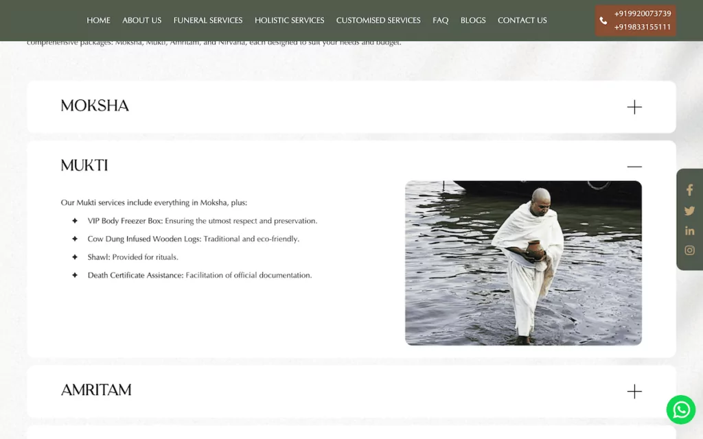
However, cultural context plays a significant role in how colors are perceived, rather than them being a universal psychological impact. For example, white represents purity and cleanliness in Western cultures, but with mourning in some Eastern cultures, such as India. Funeral service providers in these locales—for one example—often have a color palette that would be more suitable for a business website in the West.
These aspects become crucial when you want to create a multilingual website that caters to diverse audiences.
The Best Colors for Different Website Types
You might already have instinctive knowledge of the color palettes different site types use. However, nailing them down as inspiration is a different matter.
Next, I’m going to share specific recommendations for various website categories, along with considerations for maintaining visual consistency across different languages and cultures. I can’t include every site type, so instead I’ll look at some of the most popular.
E-Commerce Websites: Converting Colors That Sell
E-commerce website design is hard. This is because your color scheme needs to balance brand identity with conversion optimization, as well as present a look that customers will feel familiar with.
In my experience, I’ve found that successful e-commerce sites often use a combination of neutral colors with strategic accents to guide the user’s attention:
- A neutral primary color (such as white, light gray, or beige) for the background.
- A strong, brand-aligned accent color for any Call To Action (CTA), such as buttons and sale notifications.
- Complementary colors for secondary elements.
For example, Amazon, eBay, and AliExpress all opt for this kind of color scheme:

Each brand uses suitable accent colors too. Amazon uses yellows, oranges, and various shades of black and gray. AliExpress chooses red as an accent color, and eBay likes blue.
In fact, trust-building colors such as blue and green work well for security elements and checkout processes. However, you might want to adjust these choices based on your target markets. For instance, using gold to sell luxury products might be more effective in Asian markets than Western ones.
High-contrast colors for important information and pricing can be especially important. You could use the same color as your CTA—as AliExpress does—or something that clashes with the rest of the color scheme. Amazon uses red to indicate percentage values of discounts, alongside its gray and bold black lettering.

This shows how small and subtle changes can do all the work you need.
Portfolio Websites: Colors That Showcase Your Work
With an e-commerce website’s color scheme, the goal is for the products to become the focus for the customer using neutral colors. A portfolio website has a similar focus, but tackles the task in a different way.
Here, your color scheme should enhance rather than compete with your work. I recommend a minimalist color palette that puts the spotlight on your content while maintaining professionalism.
WordPress developer 10up does this to near-perfection. The typical color palette for the site is red, white, turquoise, and gray. However, the portfolio page uses full width cards for each entry—a common tactic.
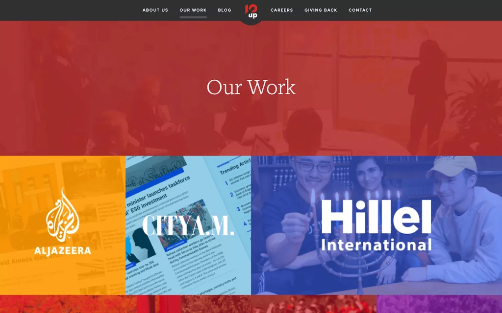
You have less room to pepper the screen with your brand colors. 10up uses on-brand headers and footers with tasteful color pairings to help bring your focus to the cards. Individual portfolio project pages use the same primary red, gray, and turquoise scheme:
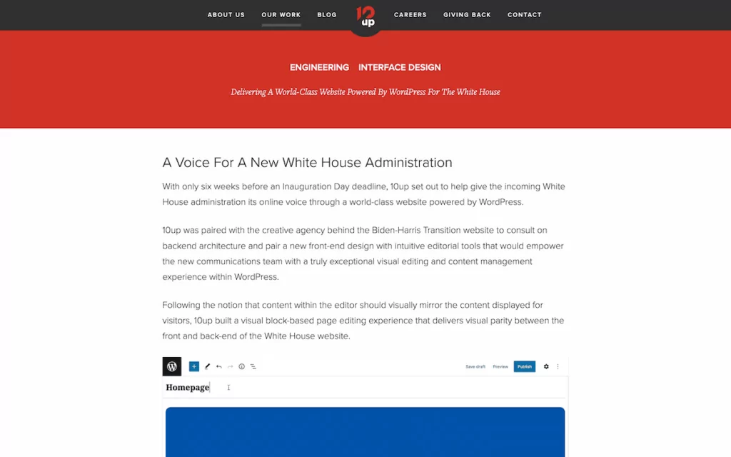
In fact, one of the projects highlights how accessibility settings can help a multilingual website. Hillel International is a campus organization for Jewish students. The color scheme conveys trust, with a heavy use of blue. However, it also includes a high-contrast accessibility option that uses black.

For portfolio sites, dark mode designs are popular, particularly in creative industries. They can make images and artwork pop while reducing eye strain. When targeting international clients though, consider offering both light and dark options.
Healthcare Websites: Building Trust Through Color
Much like business websites, healthcare industries benefit from color schemes that convey professionalism, cleanliness, and trust. Blues and greens dominate this sector for good reason—they’re associated with medical environments across many cultures. However, the specific shades you choose might need to vary by region.
It’s interesting to note that the differences in colors are subtle across the globe. For example, Bombay Hospital Trust operates across a few Arab and East Asian locations. The website uses sky blue and red, typical of Eastern medical facilities in my opinion:

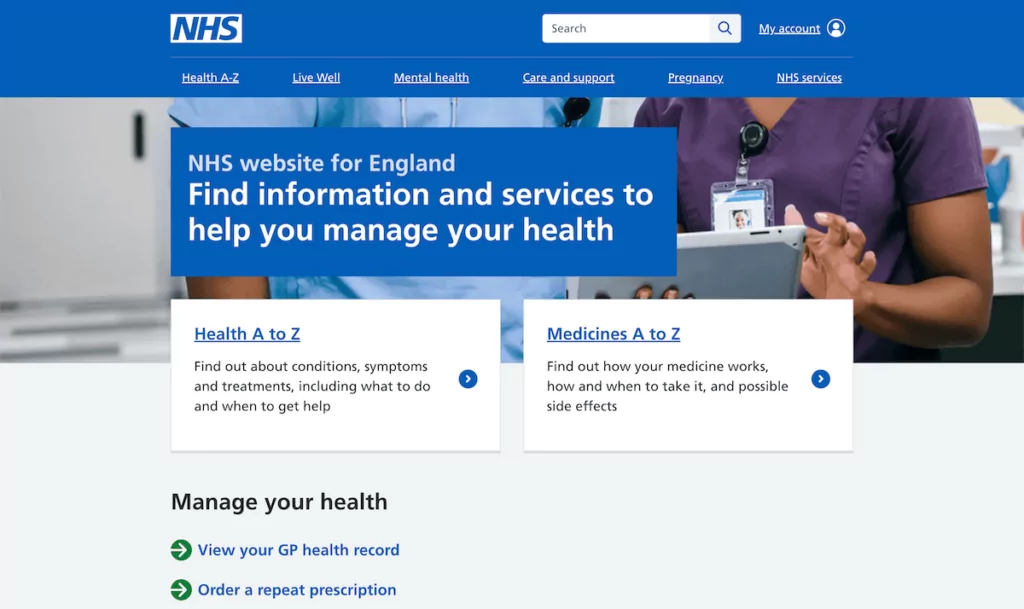
If you compare Eastern and Western cultures, medical websites use deeper and bolder colors in the US and United Kingdom (UK). For instance, the UK’s National Health Service (NHS) website uses a strong contrast between white and blue, with green as an accent and highlight color:
The University of California San Francisco (UCSF) website uses bold colors, but with less saturation:
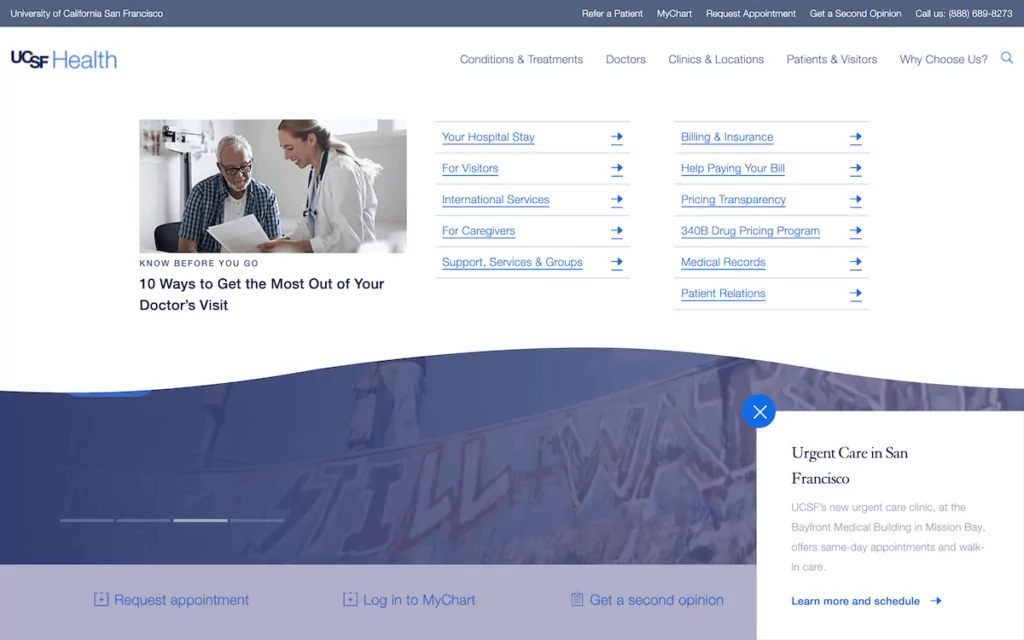
The paler blues almost look gray in some locations, but you still get a sense of trust and professionalism as you browse the site.
Educational Websites: Engaging Learning Through Color
Educational websites also need to strike a balance between professionalism and engagement. While traditional academic institutions often stick to conservative color schemes, online learning platforms can be more experimental with their color choices.
It’s interesting to me that typical colors for educational websites across the globe are so narrow. Take Alma Mater International School in South Africa. You could remove the location, and the design would fit in practically anywhere in the world.

The key is to use colors that facilitate learning without causing a distraction:
- Consider cool primary colors for main content areas.
- Use warm accent colors for interactive elements.
- Provide neutral backgrounds to reduce cognitive load.
- Choose high-contrast combinations for important information.
For online learning platforms, color choices have much more flexibility. One of the more popular options, Coursera, chooses to opt for a typical color palette for its website:

However, a modern platform such as a Brilliant eschews this in favor of minimalist colors and a green accent:

Skillshare also uses green, and this is much more vibrant and stimulating than is typical for an education platform:

My opinion is that the target user for online course marketplaces and learning platforms is different from long-term education. For the latter, conscientiousness, care, trust, and professionalism matter the most, regardless of where in the world the student lives.
Tools for Choosing and Testing the Best Colors for Your Website
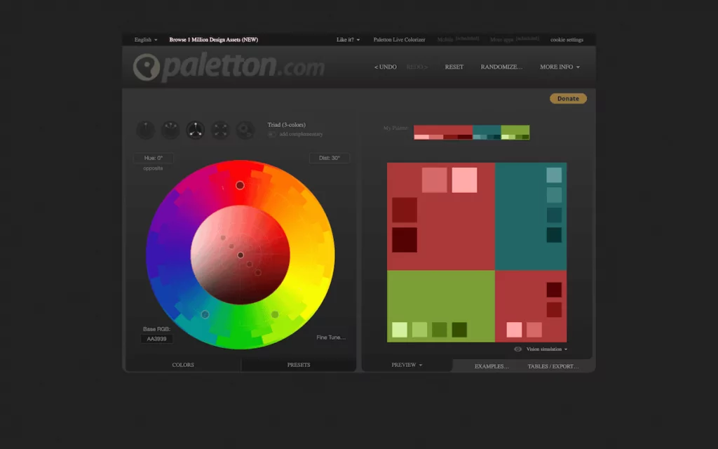
There are several tools that can help you create and validate your color schemes. I’ve tested a lot of these, and fall back on a few. The Paletton website is a good way to find basic color schemes and visualize them relative to one another:
For more scope and flexibility, I love Coolors. This is an app I have a premium account with and it’s one I use often. The premise is simple: click the spacebar, and generate a new color palette:
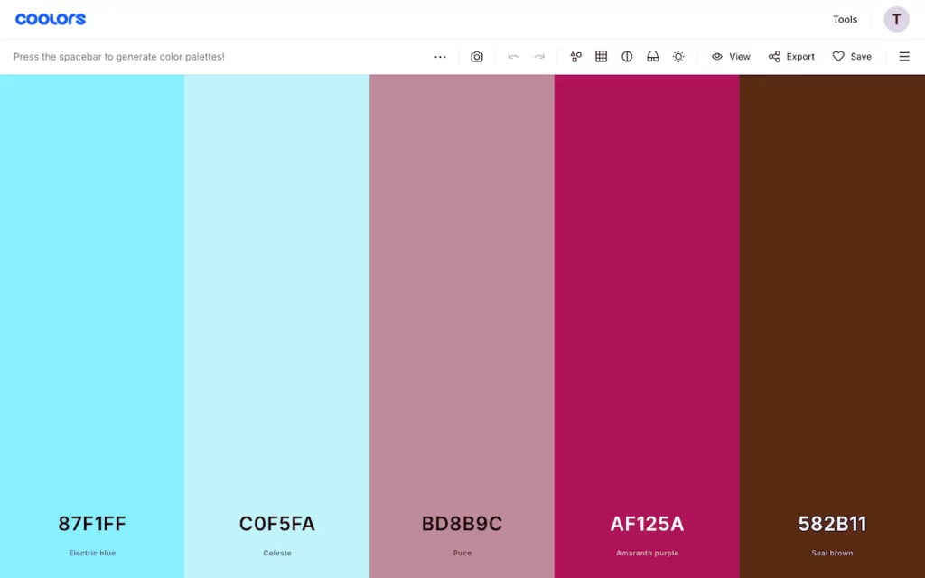
You can move colors around, add or remove them, save them to dedicated palettes, and more. It also includes a contrast checker, a tool to test how your palette looks with color blindness, and visualization tools.
If you’d like to use Artificial Intelligence (AI) to generate colors, Khroma could be the app for you. It asks you to choose 50 colors you like upfront, then uses the answers to generate palettes for you.
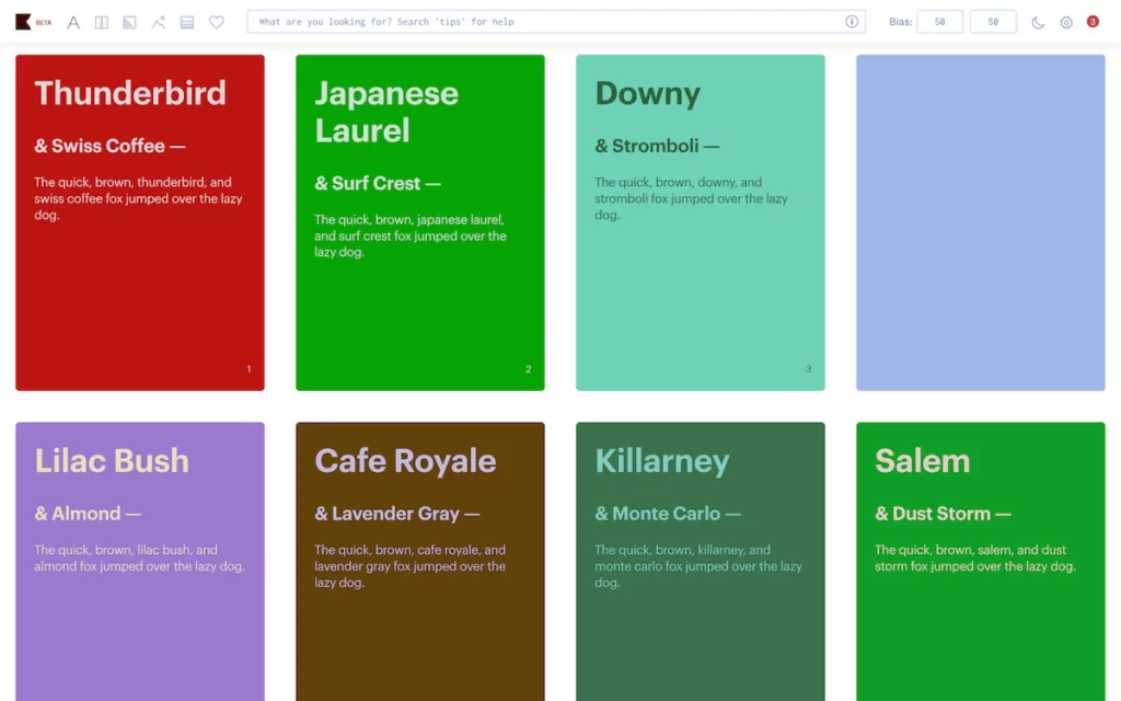
It essentially learns your color preferences, which can be helpful to adapt your color scheme for different cultural contexts. However, as far as I can see, Khroma doesn’t yet have a way to check contrast like Coolors can. For this, you can lean on dedicated tools such as WebAIM’s Contrast Checker.
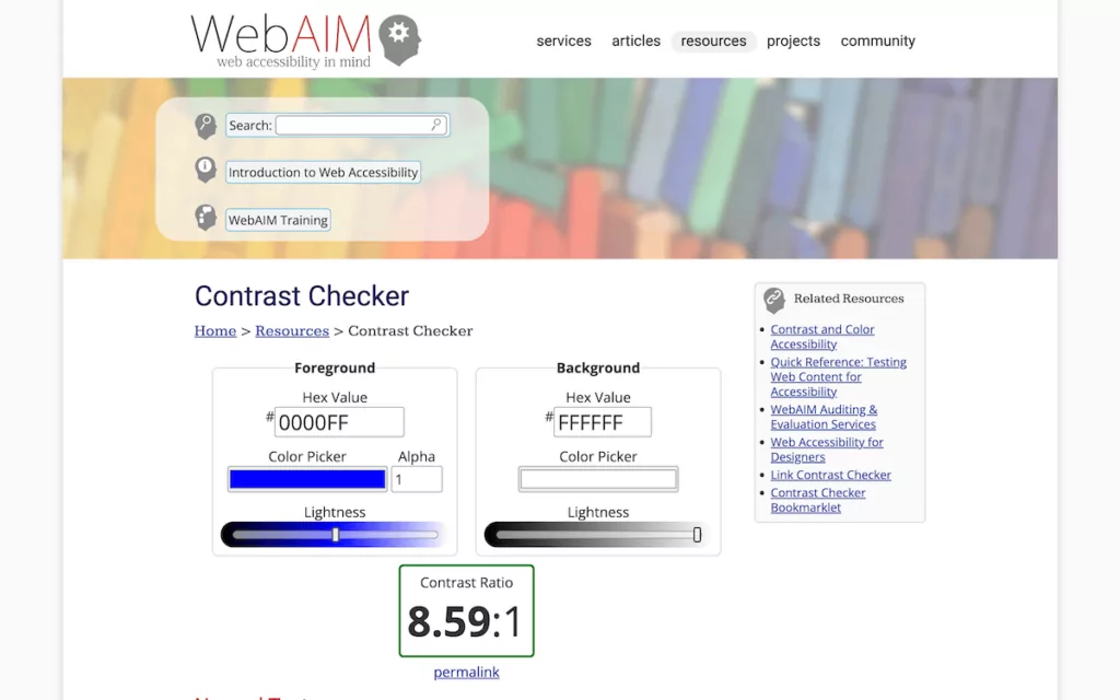
This will ensure your color combinations meet accessibility standards across all versions of your site. It’s crucial for maintaining usability across different cultures and languages, and in general for asserting an accessible design for every user of your site.
How to Implement a Color Strategy For Your Website
Choosing a color palette is more straightforward than ever in my opinion. Almost every tool will automate selections across the color wheel, so theoretically you’ll have a palette that works in harmony. Applying those color selections within an overall strategy on your site requires careful attention to detail though.
The approach I’d take is to start with your primary brand color and build around it. For instance, try it in different scenarios, such as the background or accent colors to see what looks good. Testing your color combinations across different devices and browsers will also be important here, due to rendering variances.
When it comes to multilingual considerations, consider how your colors will work with different alphabets and writing systems. For example, German is notorious for having longer words than other languages, and many Eastern countries use Right-To-Left (RTL) writing systems.
This is where TranslatePress’ Translation Editor comes into play. Color localization becomes as important as content translation, and using the editor, you can maintain visual consistency while adapting to cultural preferences.
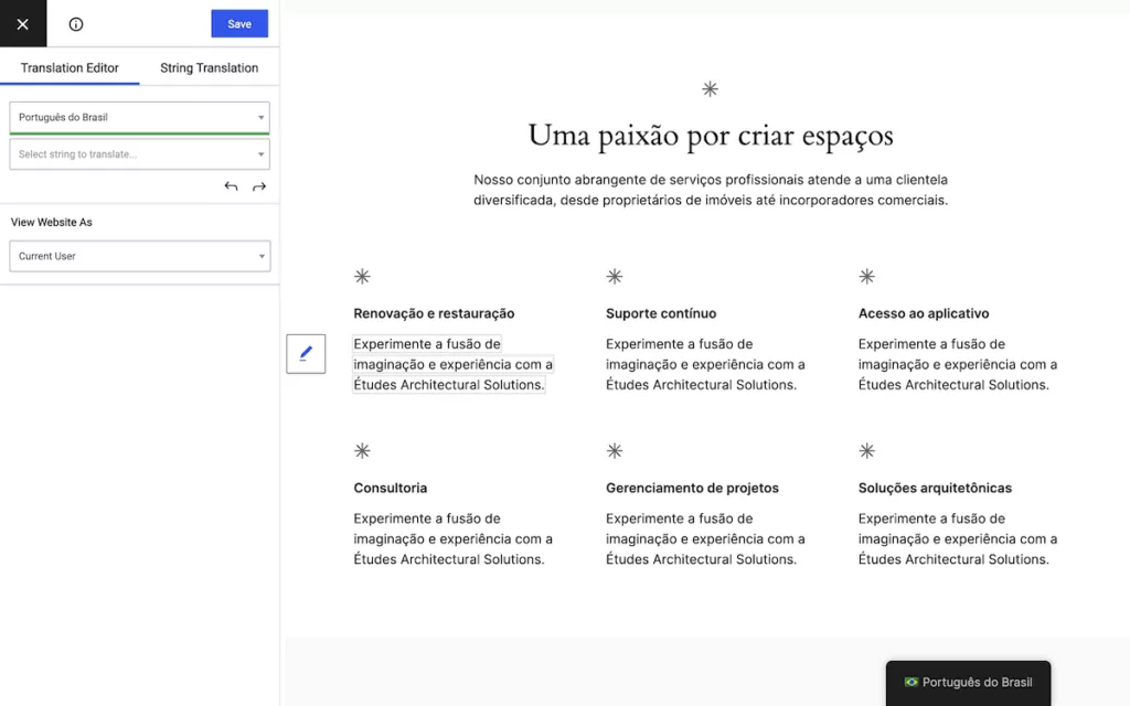
This real-time preview capability is invaluable when adjusting colors for different cultural contexts. For instance, you might want to use varying color schemes for different language versions of your site—although that would take more time and effort than a more straightforward implementation.
Remember: each language version of your site is ultimately separate from the others. As such, consider the whole presentation rather than a simple ‘overlay’ of a different language.
Your Path for Choosing the Best Colors for Your Website
Choosing the best colors for your website is a balance of aesthetics, psychology, and cultural sensitivity. Whether you’re building an e-commerce site, a portfolio, or an educational platform, remember that color choices can significantly impact your success in different markets.
TranslatePress can serve as an excellent companion for whatever color scheme you choose for your site. Its rich Translation Editor shows you how your translations will look in place, which helps you better understand the impact your design will have. Coupled with the right palette, your multilingual website should stand out and succeed.
TranslatePress Multilingual
What challenges do you face when choosing the best colors for your website? I’d love to hear about your experiences in the comments section below!